Mobile eLearning
Providing a cross-channel experience for the learning platform Haiku Learning
Background
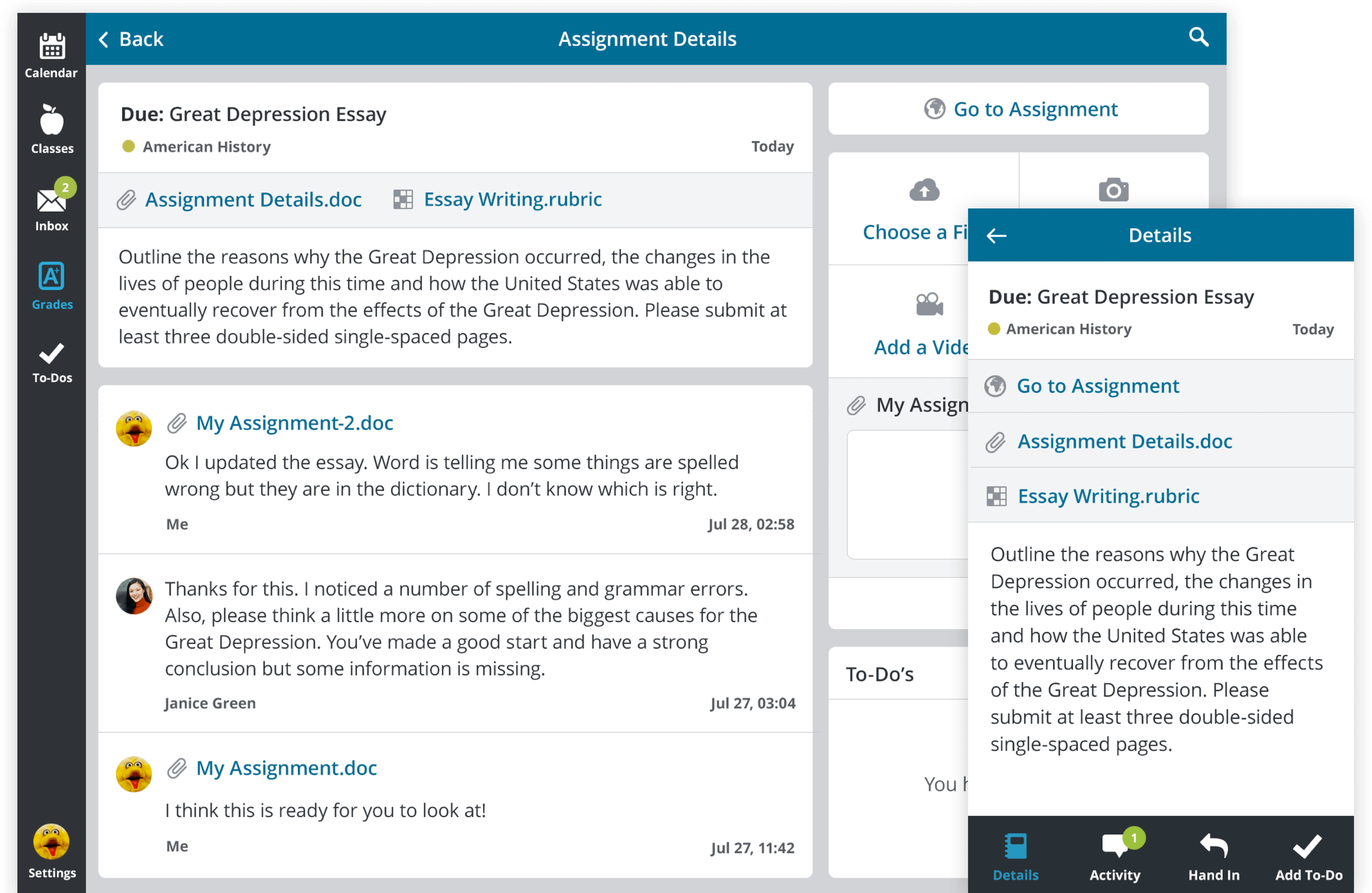
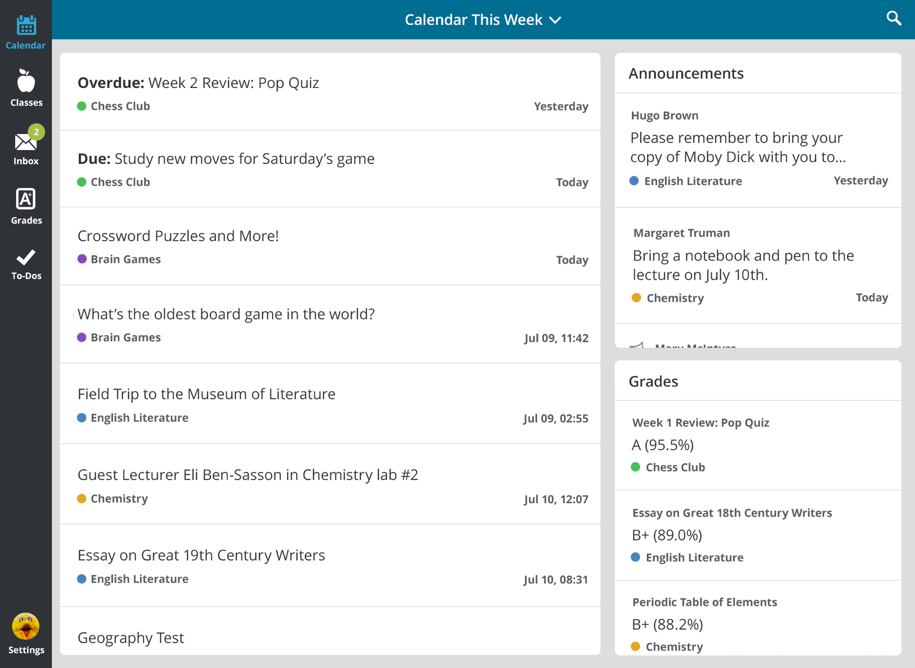
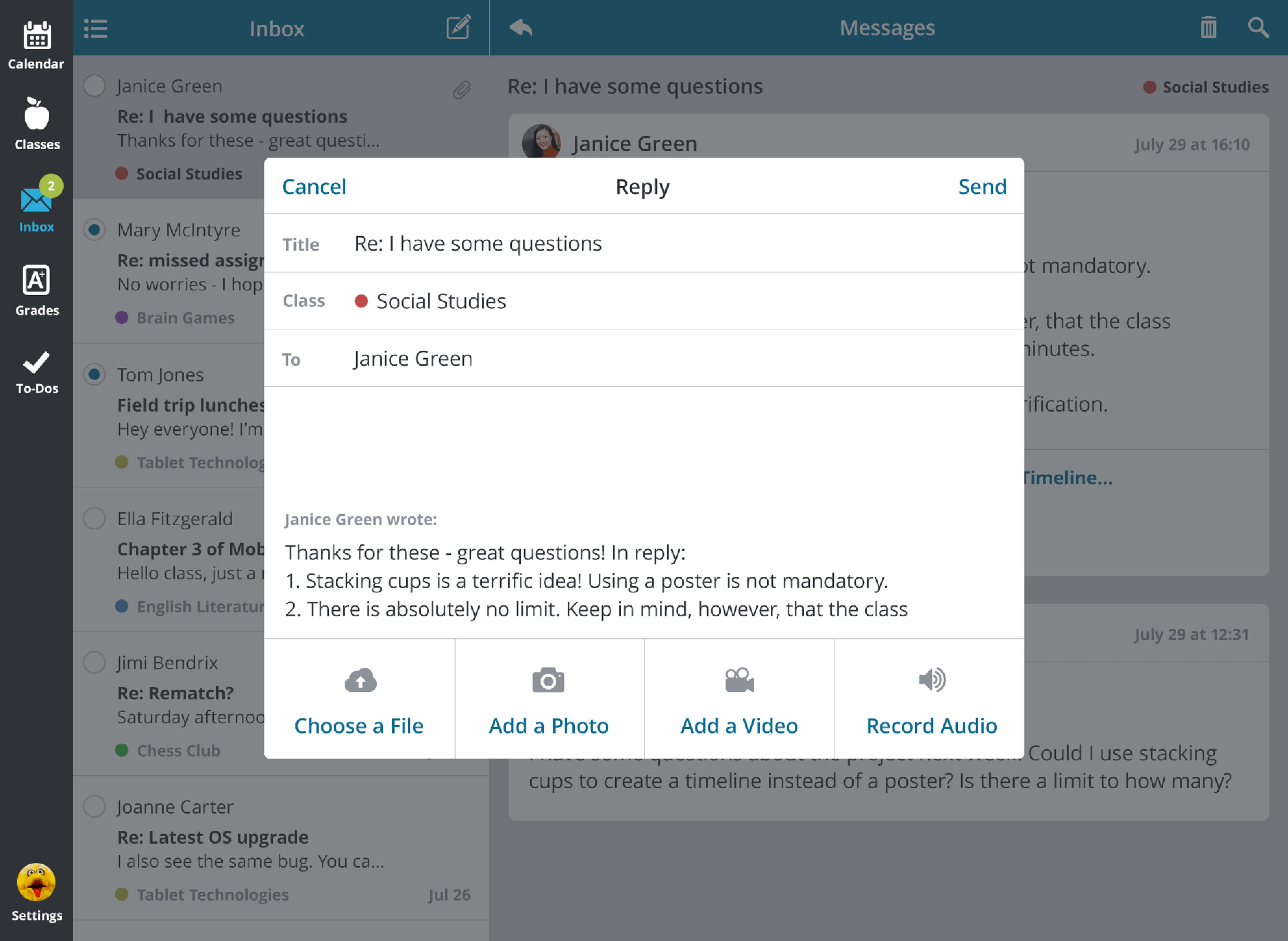
Haiku Learning was a small elearning platform competing in a crowded market of learning management platforms. They offered, in addition to their desktop-based application, a native iPad app with a calendar, assignments, messages and to-dos.
Users were demanding new functionality and improvements to existing features in the iPad app, however adoption and engagement were very low. Competitively, larger and more popular elearning platforms were already releasing full-featured iOS and Android apps for their software. Meanwhile, the most frequently asked-for new feature in Haiku Learning was an iPhone app.
Recognizing the need for a stronger and more useful mobile presence, my first project after joining the team was to create a cross-channel experience for an audience that increasingly relies on mobile devices.
Challenges
With a relatively small development team, Haiku Learning had both budget and resource constraints. It was a challenge for me as a user researcher as there was not a great deal of analytics and feedback on the existing app available. It was also difficult to gather direct student feedback, as we were not able to interview or conduct testing with anyone under 18 years of age without parental involvement.
Phase 1: Improve the iPad App
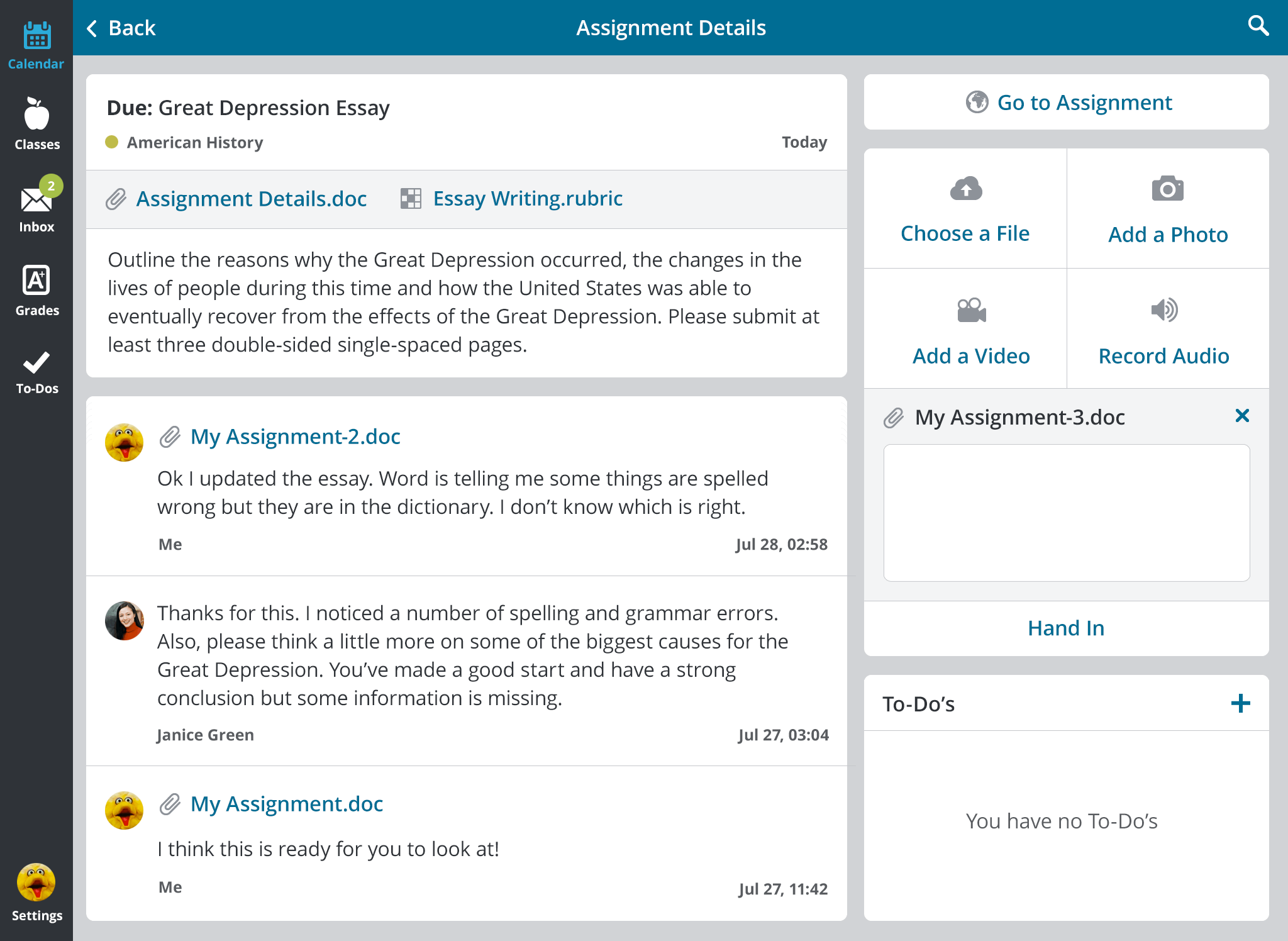
I first performed an heuristic evaluation and an expert audit, then reviewed feature requests and bug reports. I interviewed both existing and first-time teacher users of the iPad app and conducted moderated usability testing with them in order to highlight both user’s biggest pain points with the current iPad app, as well as their most pressing unmet needs. These were turned into user stories and all task flows were revised to best meet these goals:
- I want to be able to use the app regardless of my age or experience with technology
- I want to see what I need to do now, tomorrow, and next week
- I want to be able to search everywhere including in my inbox, grades, activities and to-dos
- I want to be able to create and attach media to my assignments and messages
Phase 2: Add Grades to the iPad App
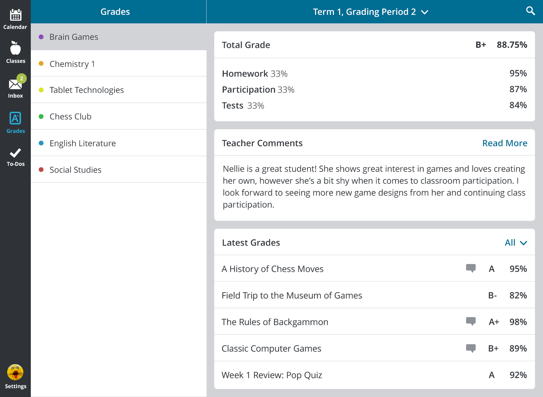
The most frequently requested iPad feature was the ability to view grades. While a report card might initially seem like a straightforward project, the flexibility and detail that Haiku Learning’s web platform provides for grading required a much deeper dive into the specifics of how to structure the architecture for this feature.
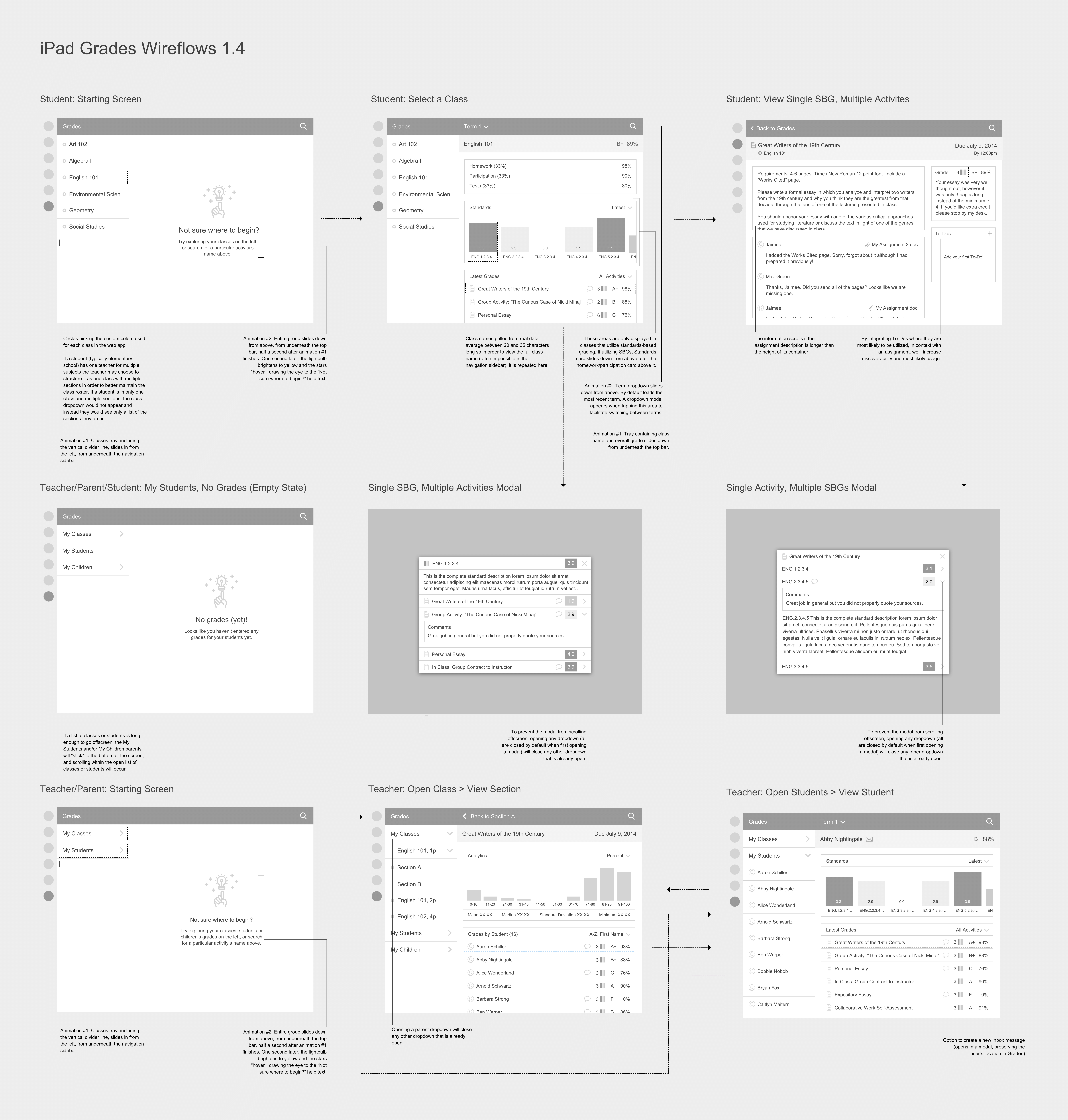
I created an interface that allowed users to view grades by role, class and individual student, by grading system type, by term, class section, and by activity type. Due to a tight timeline—the feature had to be launched within a few months, in time for the start of the new school year—I performed guerrilla usability testing on partially interactive wireflows (wireframes + user flows) with co-workers and random internet users via Usability Hub's Five Second Test.
Phase 3: Create an iPhone App
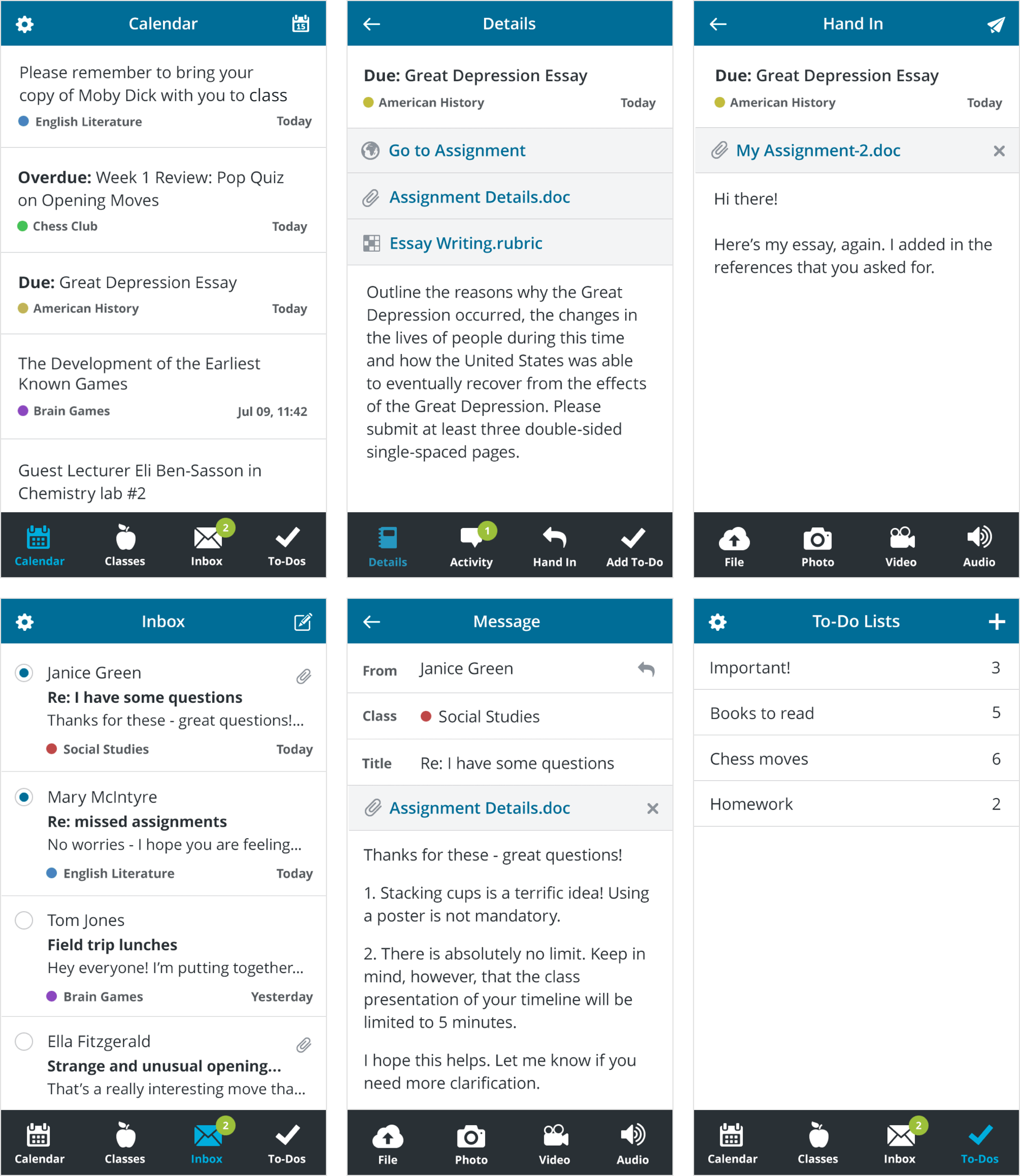
In interviews, students and parents indicated that their primary needs in an iPhone app were to check what events are happening and what homework is due next, as well as their messages. Students and teachers also wanted to more easily be able to attach media created with their phone to assignments. For this reason, I prioritized the Calendar, Inbox and Assignment Hand-In features in the iPhone app.
Conclusion
After the launch of the iPad app's improvements, feedback on the changes was overwhelmingly positive. The number of users utilizing the iPad application tripled within the first three months, and continued to rise, while simultaneously doubling the number of login sessions. The home screen experienced a nearly tenfold increase in the number of items that were interacted with during a single login session.
Customer feedback after launch of the new Grades feature was positive and adoption was high by teachers, parents and students alike.
As of 2016, the iPhone app was in the initial stages of development and QA, and interactive prototypes were undergoing further user testing and design iterations.