The Perfect Trip
Optimized a flight-finding startup, discovering a better business model
Background
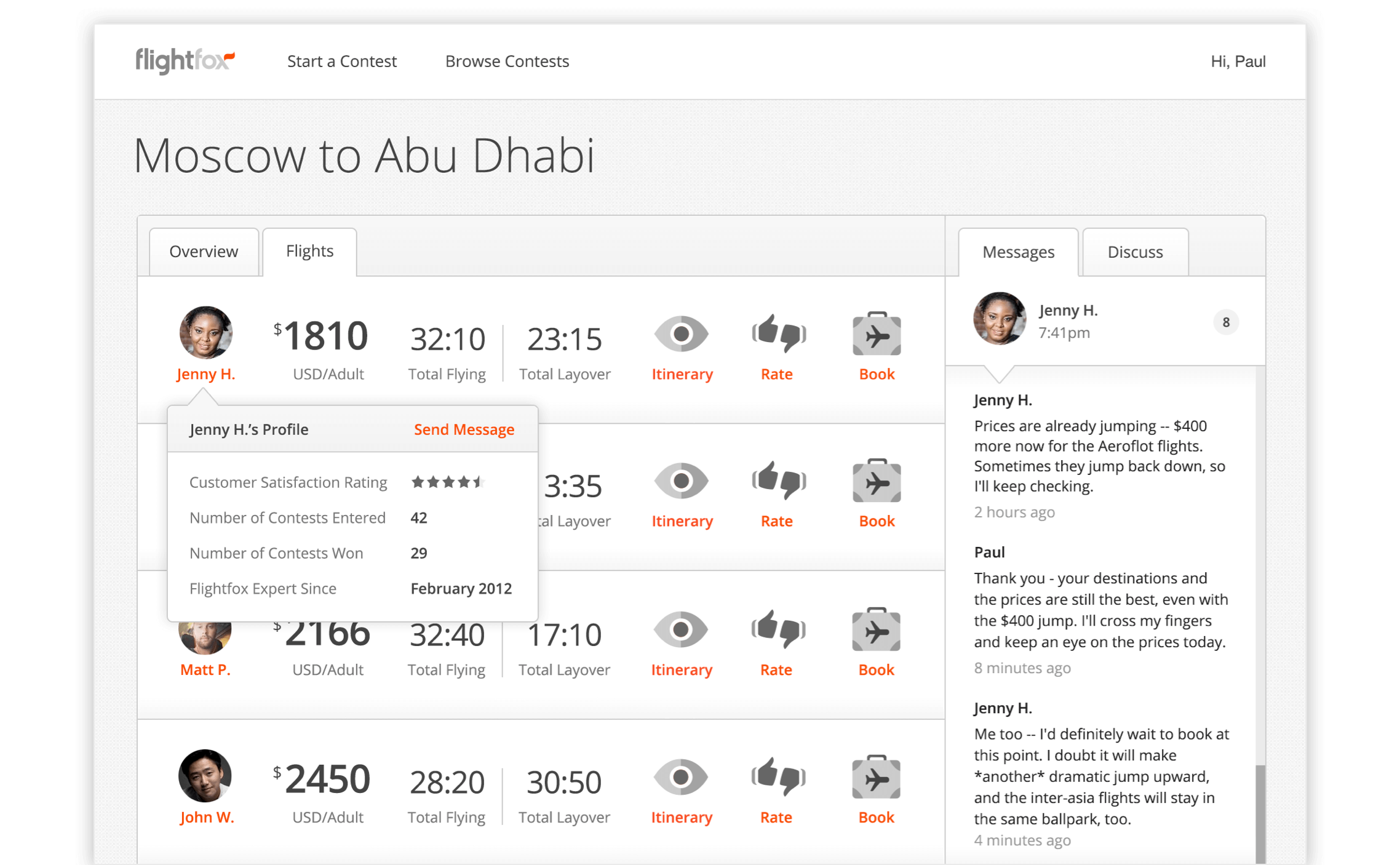
In 2013, Flightfox was a promising startup based on the premise that crowdsourced flight experts could find the best flight deals available. Flight experts were usually frequent travelers who had learned all the tricks to find the best prices, nicest airlines, most convenient routes, and discounted business and first class upgrades.
How it worked: a customer pays a set fee to start a flight contest. Any number of freelance flight experts can then review their trip preferences and try to find the customer the best flight possible. The customer reviews the offers, then chooses the flight expert with the best offers. They work with the chosen expert one-on-one to finesse the trip until the customer is ready to book the flight.
I joined the team to help improve the user and service experiences for the inconsistent flight contest outcomes and customer satisfaction ratings. In the process I also redesigned the marketing site, the app and the Flightfox logo.
Process
We utilized a Lean UX (Agile) cycle for our projects:
- Evaluate contest interactions, satisfaction ratings, analytics and recent A/B tests
- Note problems and create hypotheses then collaboratively iterate on design solutions
- Develop the solution in ideally no more than 1 to 3 days then test it
- If the solution generates positive evaluations it is kept otherwise changes are rolled back
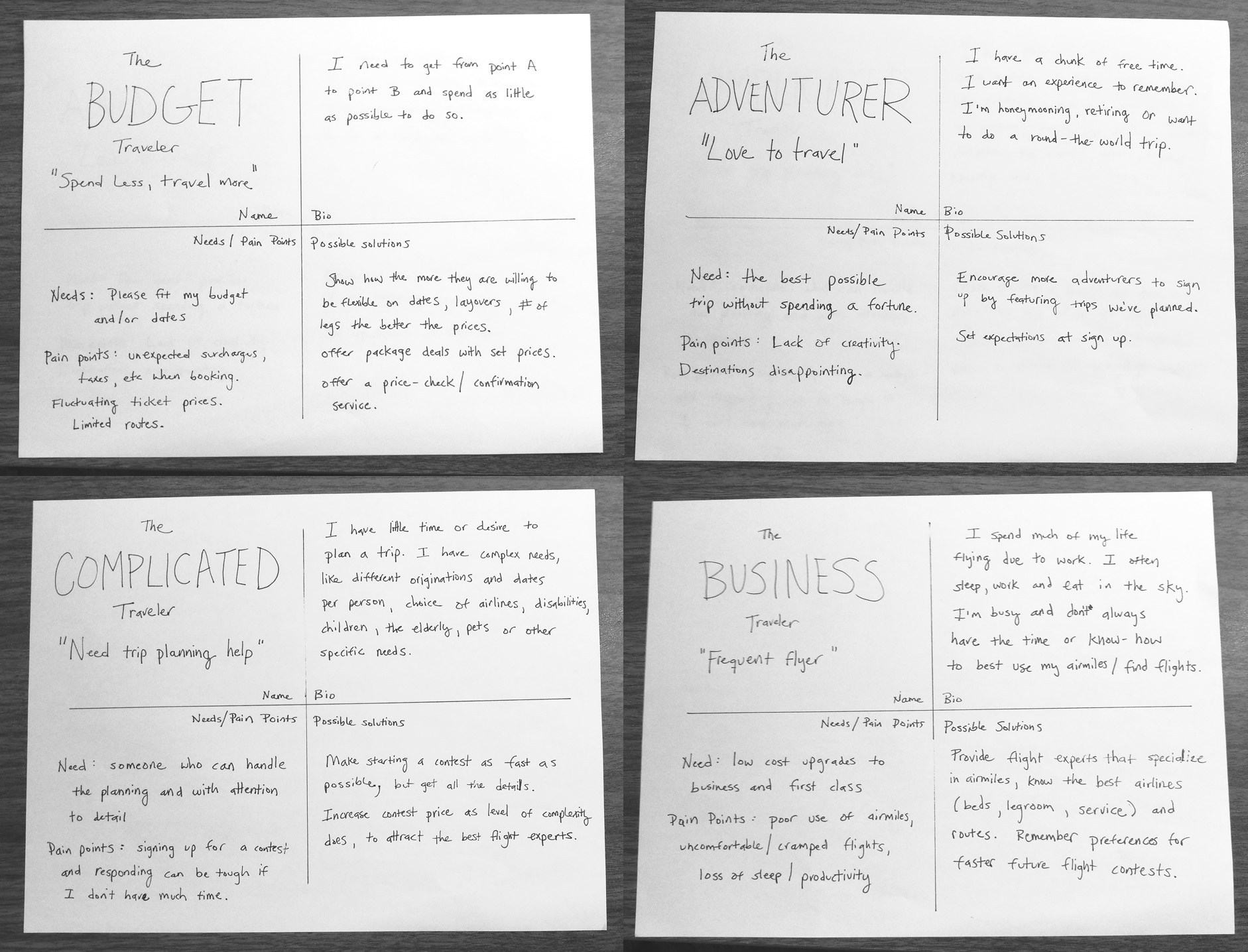
We also utilized personas:
- The Business Traveler: "Frequent flyer"
- The Budget Traveler: "Spend less, travel more"
- The Adventurer: "Love to to travel"
- The Complicated Traveler: "Need trip planning help"
When our customer support representative left the team, the remaining four of us decided to equally divide answering support tickets among ourselves instead of hiring a new team member. We also personally monitored flight contests as often as we could, time zones taken into account. This allowed us to get as close to customers and flight experts as possible on a daily basis, gaining deeper insights into their needs, desires and pain points.
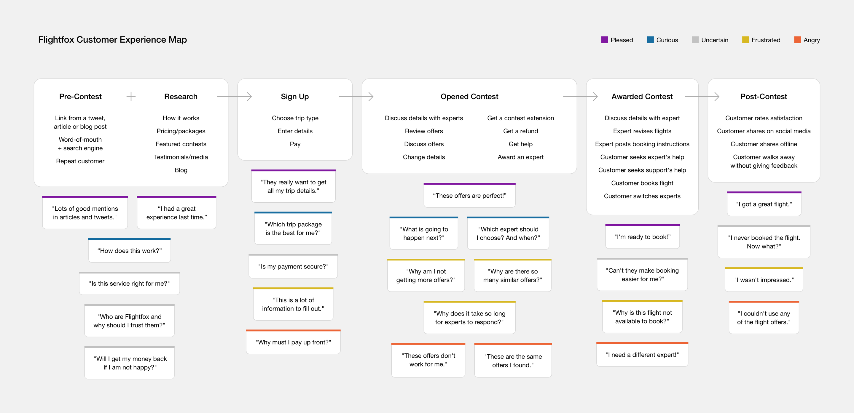
The Customer Experience Map
I mapped projects to their touchpoints in the Flightfox customer experience as well as to our personas. Below are examples of some of the projects that I worked on: some tiny, others more complex.
Increase Trust in Flight Experts
Problem
Customers had little to no information about flight experts. This created doubts and lack of trust in experts at nearly every step of the customer experience.
Hypothesis
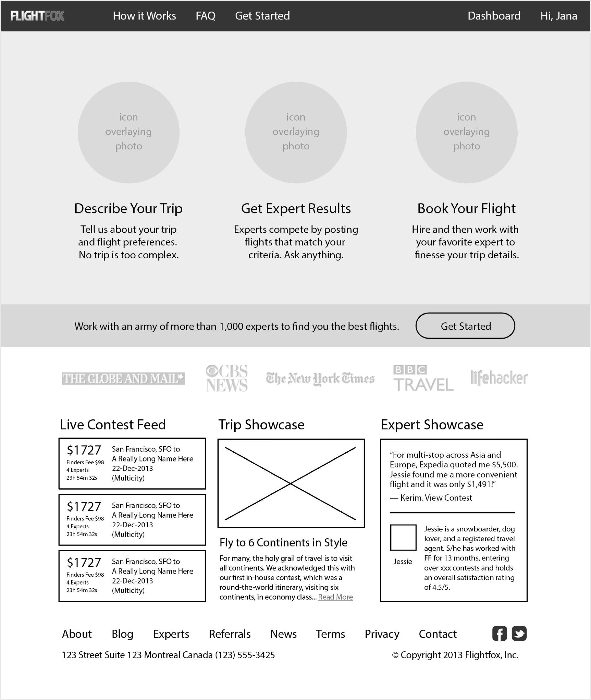
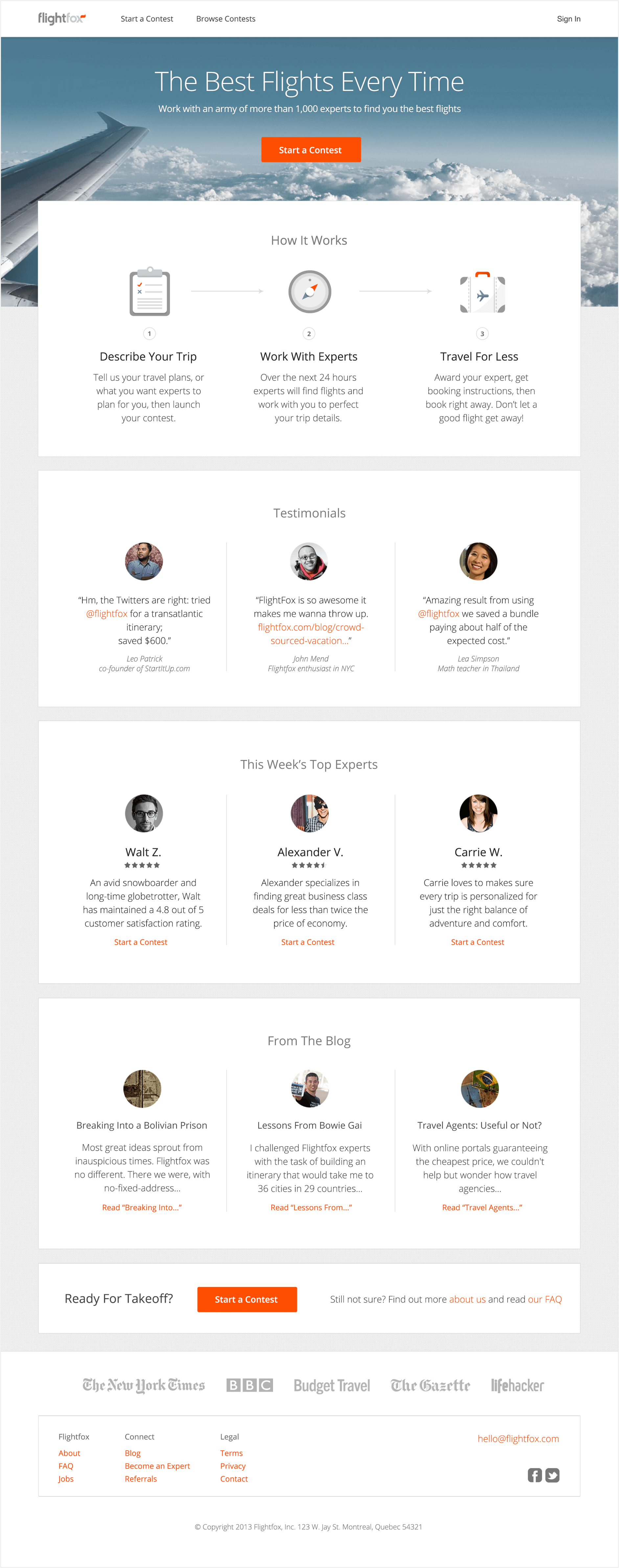
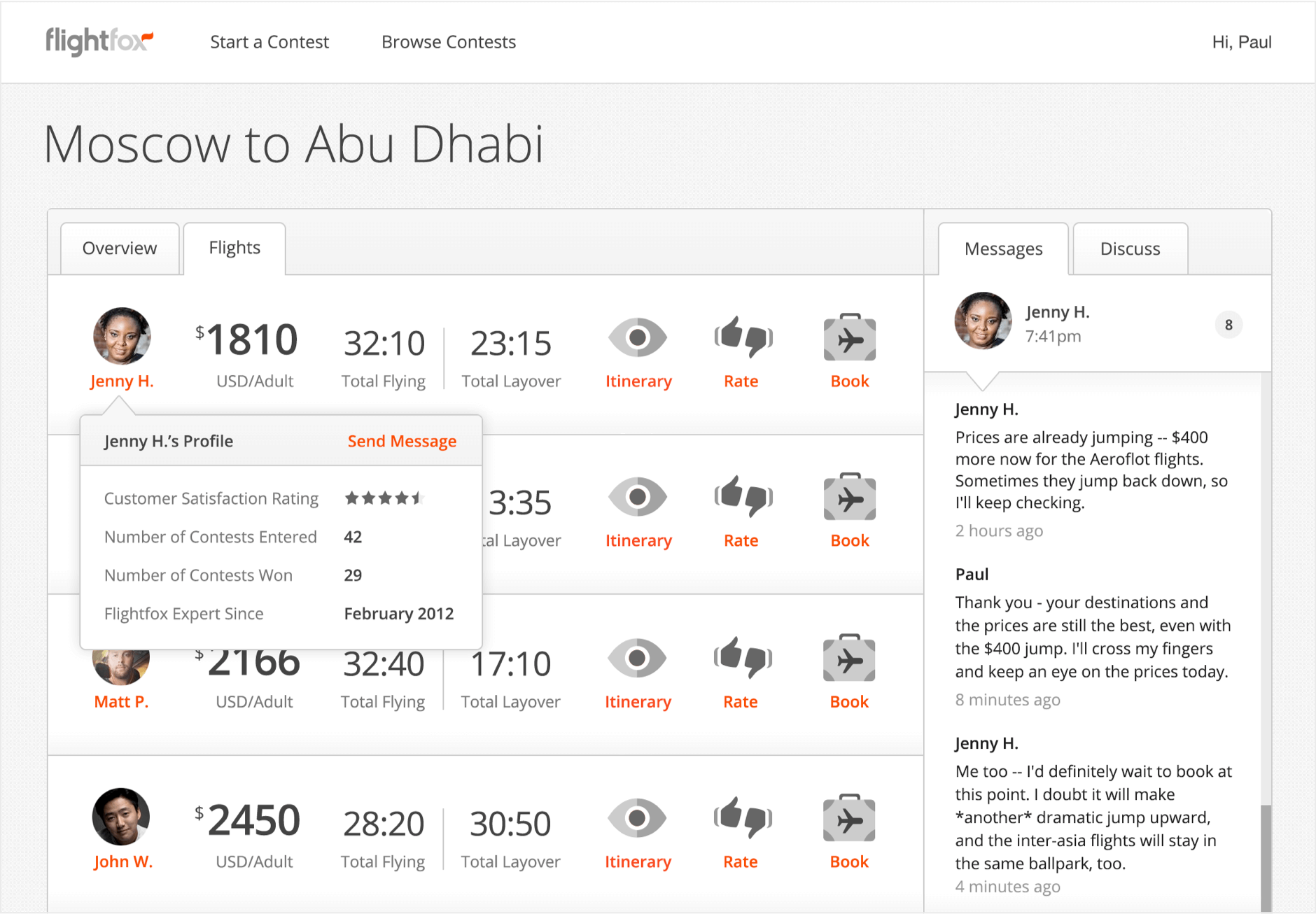
Increase trust by requiring experts to use real photos and names. Provide their biographies, a history of their customer ratings, their average customer rating, and contests entered versus won ratio. Feature top experts' biographies and ratings on the homepage.
Outcome
Contests were awarded more quickly, less switching to another expert after awarding was observed across all contests, and more customers tweeted about their experiences mentioning experts by name after the end of contests.
Boost Communication in Flight Contests
Problem
Flight experts and customers were often in different time zones or on different schedules. Communication could drop for 3 to 8 hours at a time, resulting in frustration, missed flight opportunities, and switching from one expert to another even after receiving booking instructions. In contests with many expert offers and conversations, messages with multiple experts could easily get lost in the noise. When contests were not going well users often wanted to change their preferences or get a refund. Any delays in the response from support or experts further increased their frustration.
Hypothesis
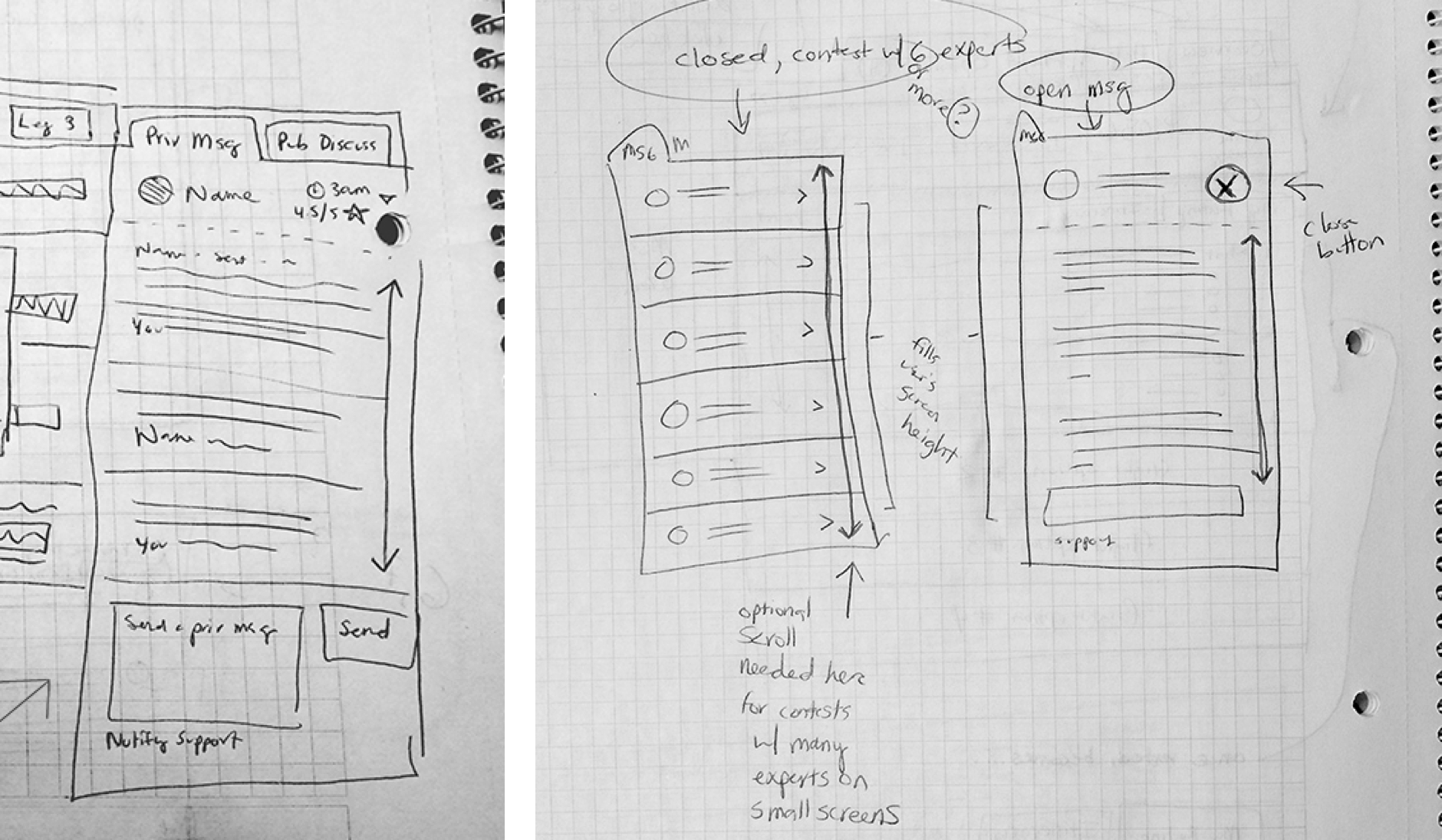
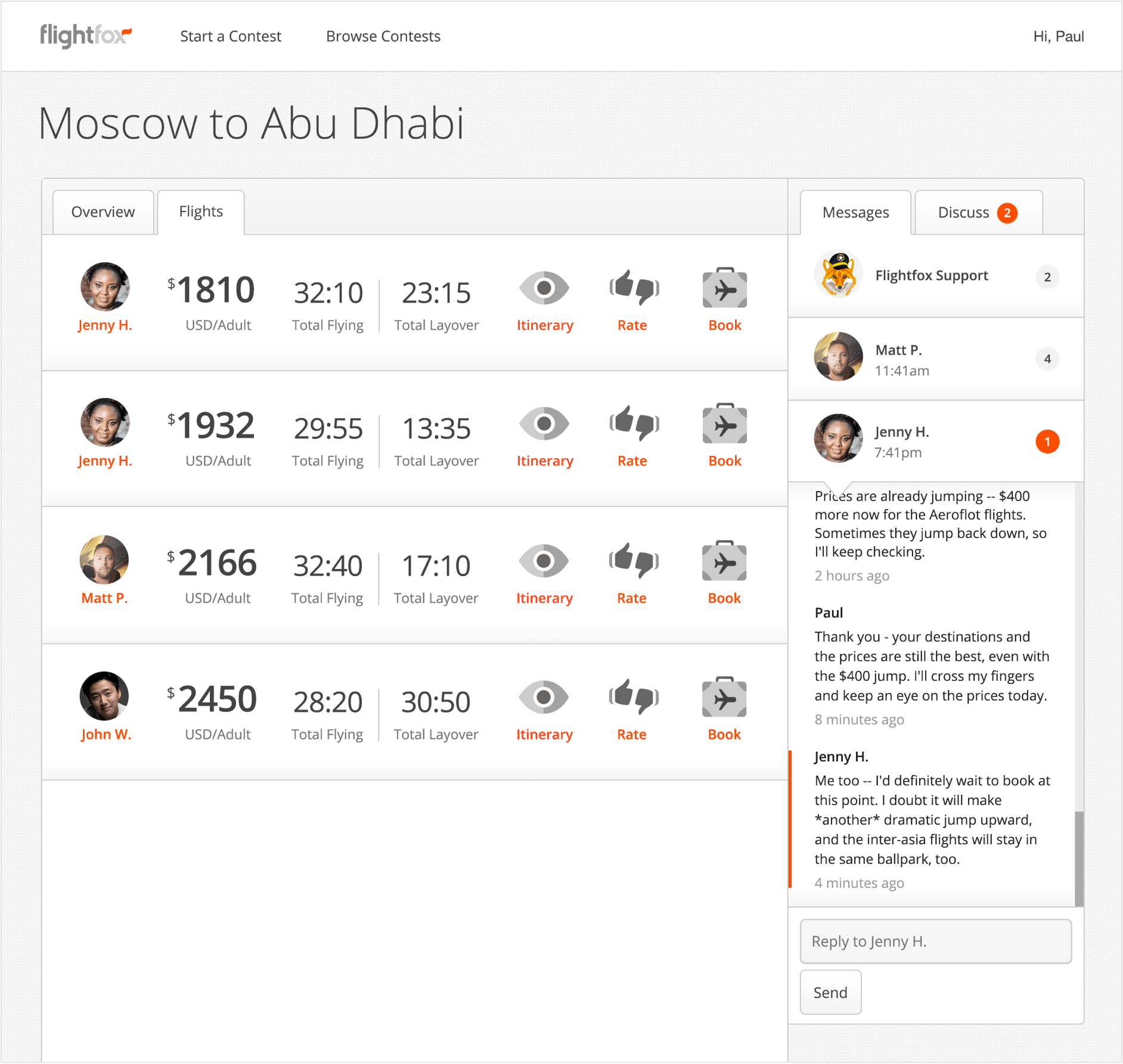
Show customers and experts each other's local times. Create a messaging interface that makes it easier to see when you have new messages, from whom, and how long ago those messages were sent. Make it easier to contact support.
Outcome
Local time indicators, message sent and new message indicators were implemented and allowed both customer and flight experts to better plan for the best times to communicate with each other.
Project: Compare & Rate Flight Offers
Problem
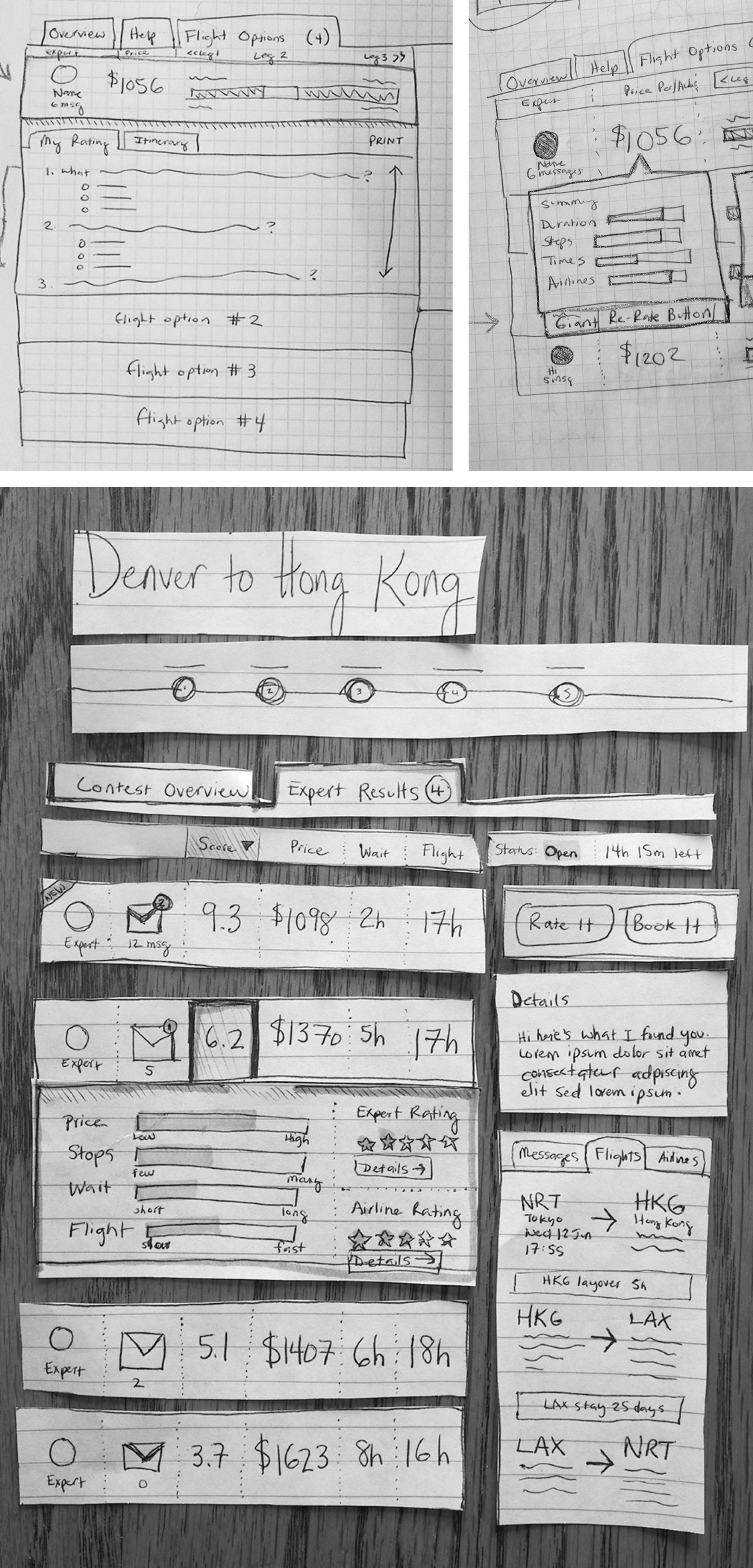
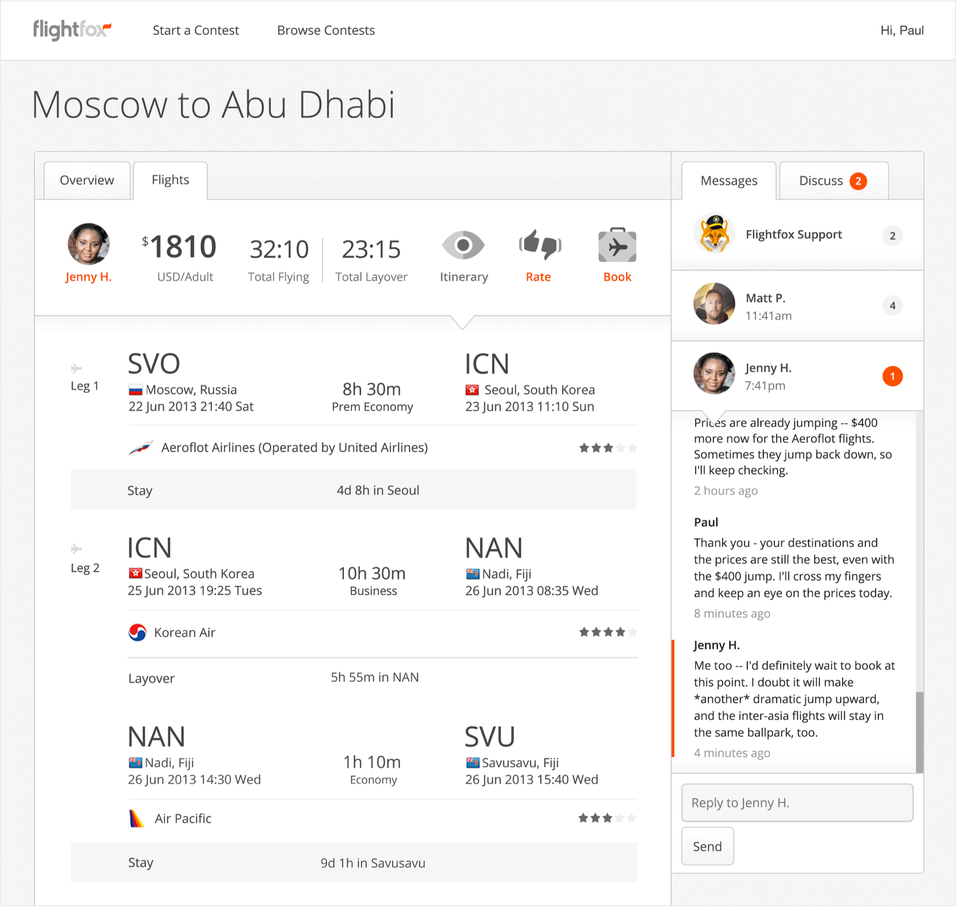
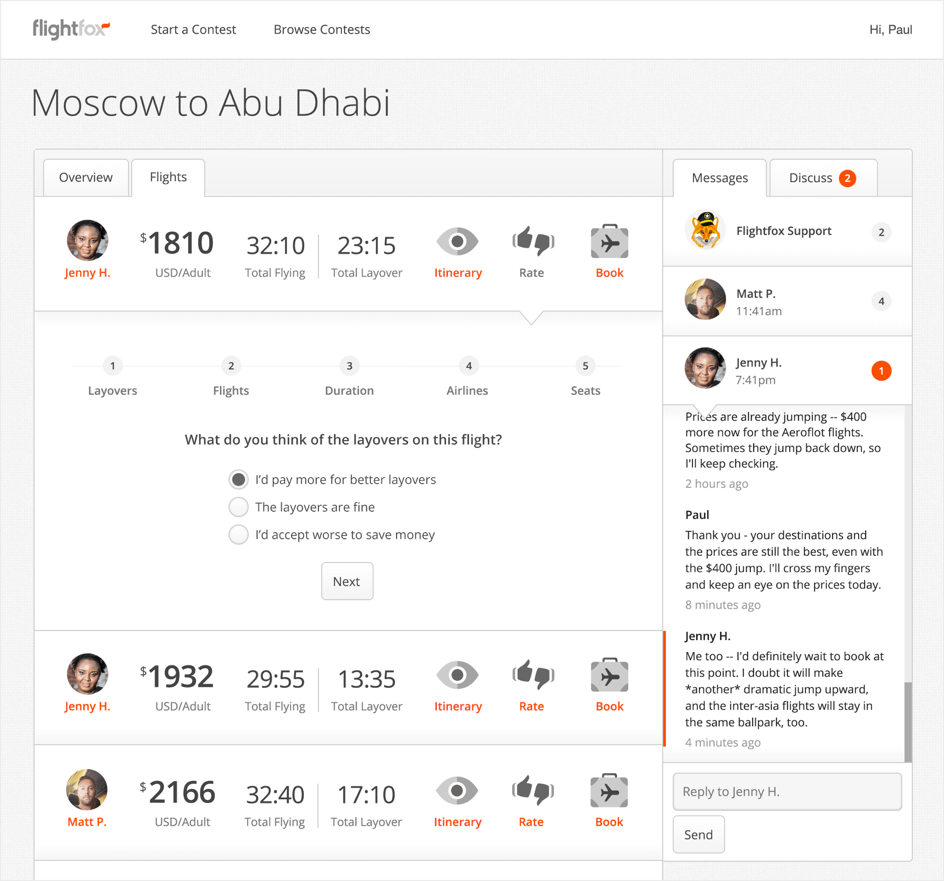
In contests where customers were offered multiple flight results they found it difficult to compare multiple similar - yet all slightly different - flight offers. They expressed surprise after choosing and booking flights then realizing later there was a long layover between certain flight legs, too early or too late of flight times, unanticipated airports or less desired airlines. Flight experts received too little or no feedback from customers throughout the process as to whether their offers were attractive and matched customer's needs or if they needed revising.
Hypothesis
Introduce detailed ratings for flight offers that allow customers to review each offer and dismiss those they're not interested in, thereby providing direct feedback to flight experts. Redesign the itinerary breakdown screen to be more easily scannable.
Outcome
Flightfox issued fewer post-contest refunds to customers. Experts were able to better respond to customer feedback on their flight offers with revised flights.
Conclusion
In the 8 months I was part of the Flightfox team I worked on nearly 40 different design projects. Of that number, perhaps one third were implemented. Many designs with potential were archived as we had to weigh the cost of development and level of complexity each contained against the question: "How quickly can we find out if and how much this will address inconsistent customer satisfaction?” Our current funding was due to end and investors wanted to see measurable results before they'd consider offering a new round.
We were able to effect changes for the positive in overall customer and flight expert satisfaction, however the outcomes of one contest to the next still varied and sometimes widely. The results of the projects we designed, coded and tested showed that the greatest variable was often the crowd-sourced flight experts themselves. We also noticed that certain experts maintained much more consistent contest success and satisfaction ratings.
Flightfox’s founders decided to dissolve the current team and go back to the drawing board. As of 2019 (six years later) their decision to change direction and switch to a business model based on hiring dedicated flight experts as team members, rather than relying on crowdsourcing experts to run flight contests, has been met with success.