An Integrated Marketplace
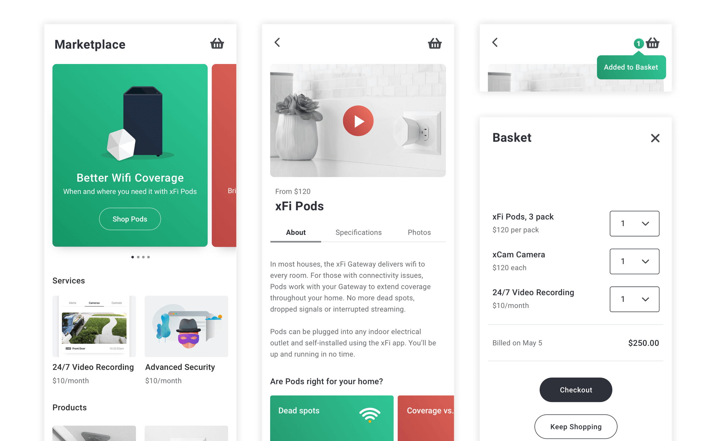
Creation of an unified shopping experience for the Xfinity mobile app
Background
Comcast provides internet, cable, digital cable, wireless and telephone services through Xfinity. Customers use the xFi mobile app to manage their smart home devices, home security system, network and user profiles. However, purchasing or subscribing to Xfinity products and services can only be done through xfinity.com, at an Xfinity store, or over the phone.
I stepped in for 6 months as an interim Lead UX Designer on the newly formed xFi Marketplace team, an initiative to offer an ecommerce platform on the xFi app. The goal was to create an integrated shopping experience that would enable customers to explore, buy and subscribe to xFinity’s offerings without ever leaving the xFi app.
Discovery
I requested that the market research team compile and share all their available research on mobile ecommerce. I sat with the data on many of the most used and successful retail sites and mobile apps out there, to better understand how the changing behaviors, expectations and preferences of online consumers are shaping mobile ecommerce.
I then interviewed current Xfinity xFi customers, asked them about their products and services then delved into how and when they reach out for support, to get questions answered, and make day-to-day purchasing decisions. Patterns emerged.
- Customers expressed interest in specific kinds of products and services but often feel overwhelmed by the number of choices online or unsure of where to start looking for information
- Customers are often unaware that existing Xfinity products and services are available to address issues with their internet speed, internet privacy, network coverage, and control of data usage
- Customers are interested in learning about Xfinity products and services but are usually not invested in taking the time to search for them
Goals
I reframed the insights gathered from competitive research and user interviews as goals:
Anticipate Needs
Don’t make customers search for answers. Instead, provide solutions first
Educate
Don’t just sell. Inform customers on how products and services help them
Be Relevant
Tailor offerings to focus on what customers probably want or need most
Mapping Relevance and Anticipation
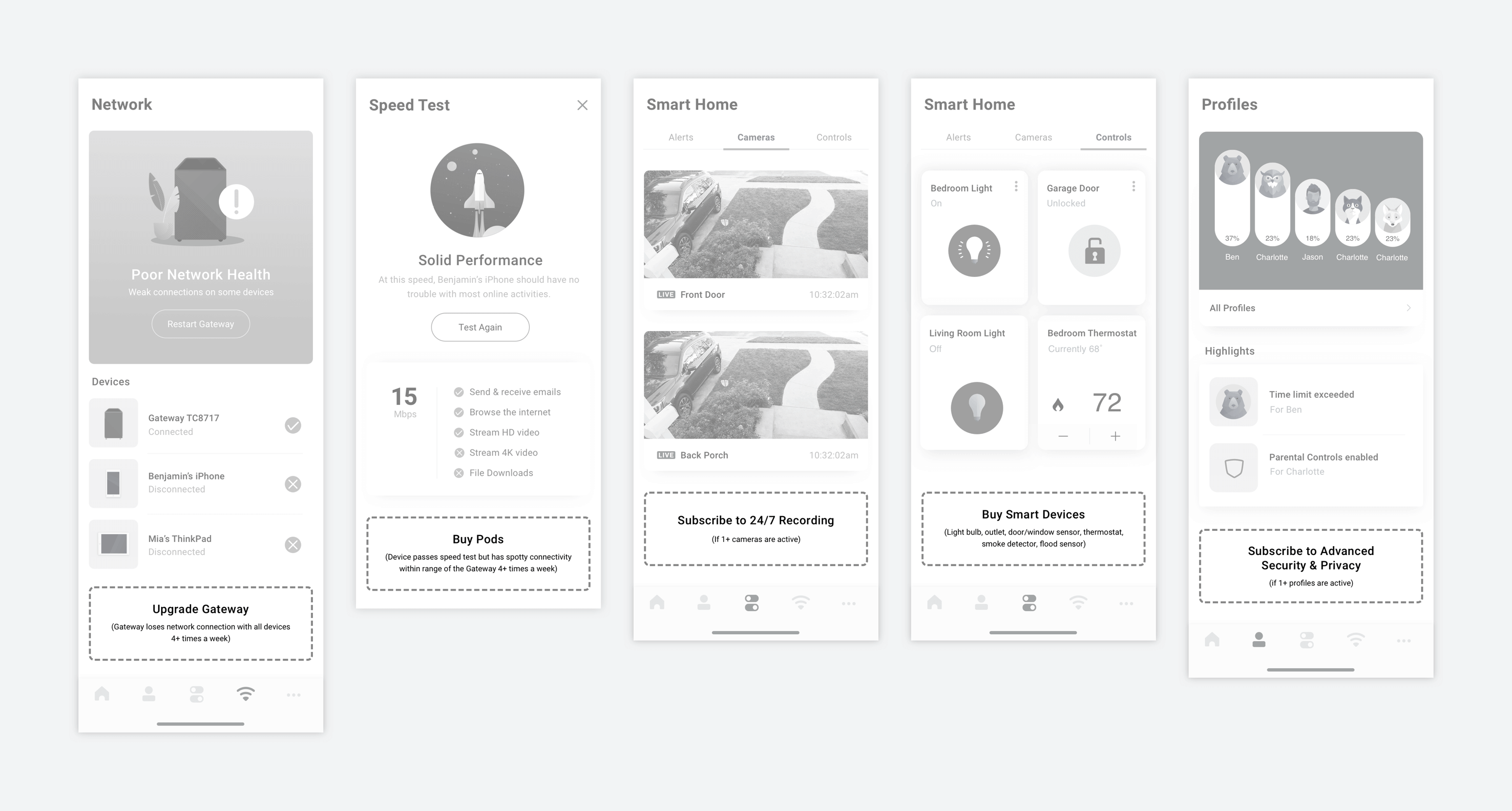
I identified locations and situations in the xFi app where problems usually manifest, where troubleshooting happens, where users go when they need help, and where mentioning a product or service could fill a relevant need.
Cross sells informed by what a customer already owns or subscribes to, the number and type of devices they have in use, account preferences, usage data and user profiles tend to be more relevant and engaging than one-size-fits-all promotions. I prepared a list of rules hinging on specific account and user data detailing exactly where and when specific cross-sells should appear.
Educating via Stories
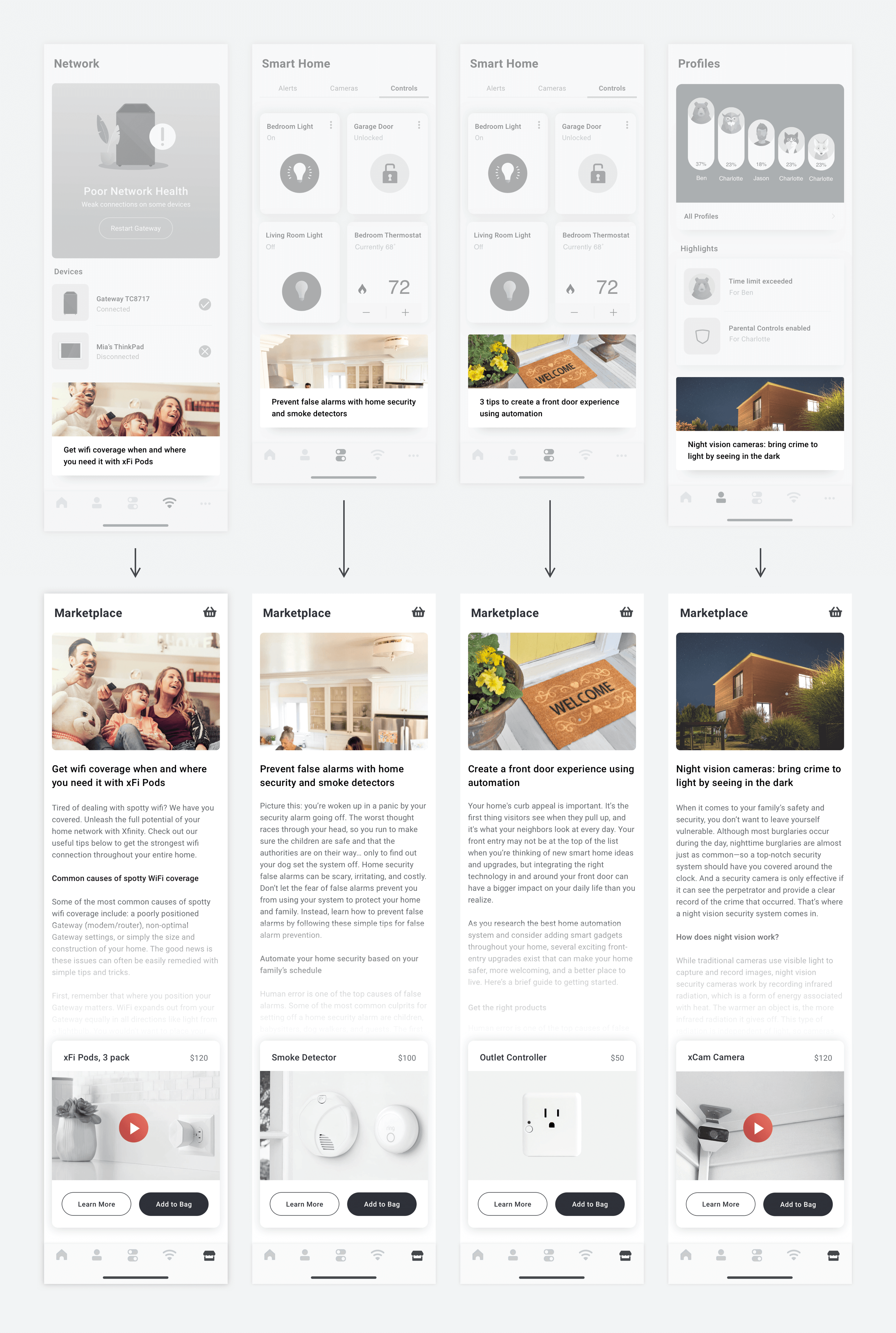
Research has shown that storytelling often engages and informs more effectively than a list of features or specifications or overt marketing copy. For this reason, I used Xfinity Hub’s articles as calls-to-action to enter the marketplace. The articles are written from the perspective of customers, explaining how customers can improve their lives or solve problems with the help of specific products and services.
Stakeholder Buy-In & an MVP Launch
Designs were shared with stakeholders and initially received an enthusiastic thumbs-up. However, product management noted that the xFi marketplace would take no insignificant amount of time and resources to build and launch. With several other projects already in motion, engineering teams would be overstretched. Meanwhile, marketing wanted xFi Pods and the xCam Camera made available for sale much sooner.
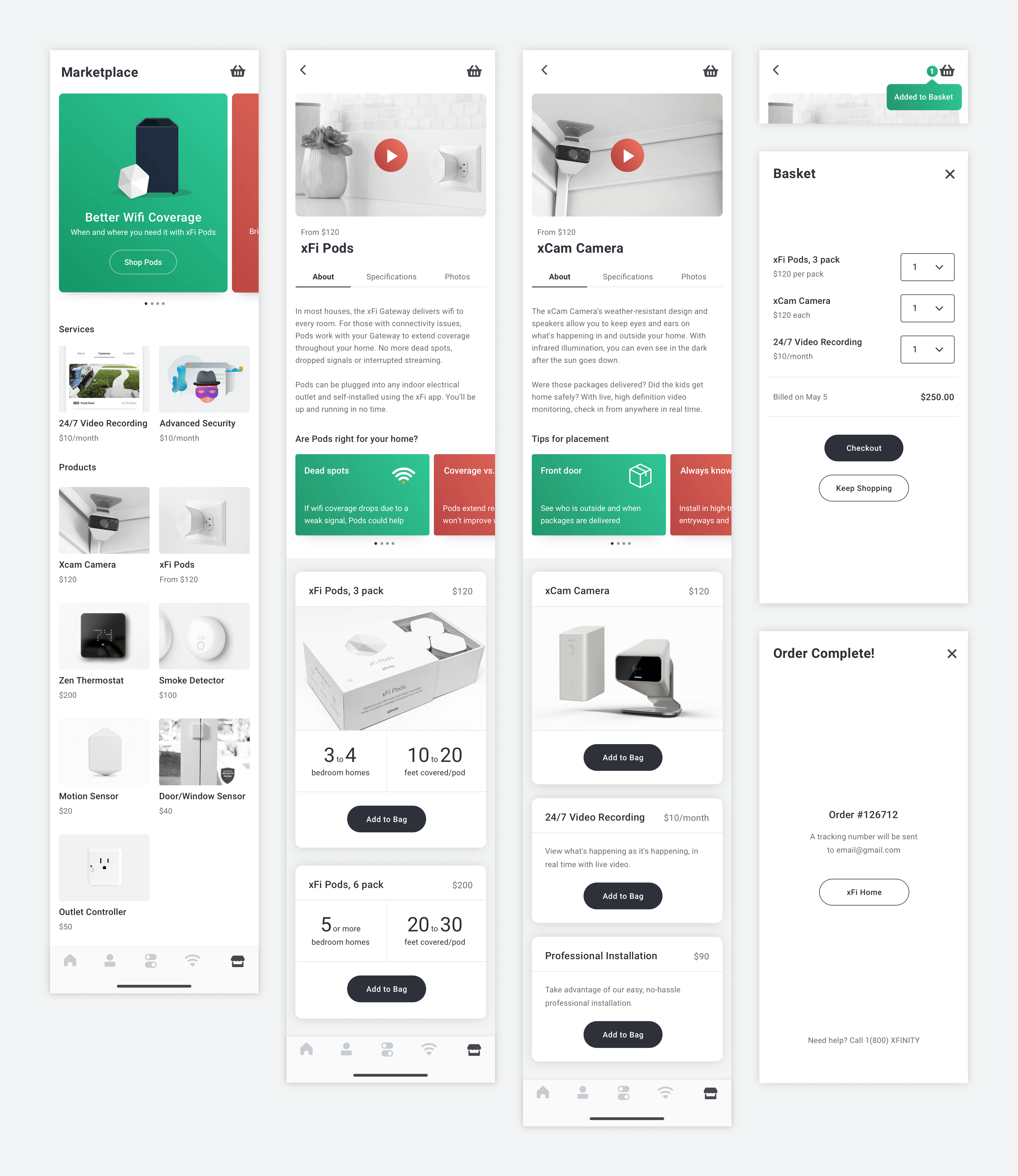
The project quickly changed goals and scope. First we’d test and launch a single product: xFi Pods, followed by the xCam Camera. This would scale to become a realistically achievable project for engineering to take on while enabling sales for Pods within just months. This would also provide our design team a live feature to actively monitor, A/B test, tweak and improve while continuing to explore the idea of a complete marketplace.
I crafted high resolution designs, worked with a 3D animator to create an introductory video, and polished the copywriting. User testing on the Pods prototypes was very well-received. During testing, users demonstrated a clear understanding of the product and easily completed checkout.
Conclusion
Detailed specifications for the development of Pods product and checkout pages were prepped and all designs and documentation of the project to date were handed off to the returning permanent Lead UX Designer. My role as the interim lead had come to a close.
Although seeing the creation of an entire Xfinity Marketplace through to launch would have been infinitely more satisfying and a much more impressive case study, I think this well demonstrates often encountered real world resource and time limitations, which can easily turn an initially robust project into a much simpler version of itself.