Manage Policies, Anywhere
Making policies easy to find and manage at PolicyStat
Background
PolicyStat's hospital and lab policy management software had accumulated a number of usability, accessibility, information architecture and user experience issues by the time I joined the team as its first designer, 10 years after its launch.
I approached this project with unusually extensive initial research and user testing in order to minimize change aversion and to prevent creating new issues for existing users that could impede the finding, reading and creation of policies.
I first introduced user research, the design process, accessibility guidelines, user testing and QA to the product team via smaller projects. This allowed them to become comfortable with these processes before embarking on the largest project the team has ever worked on.
I invited the entire product team to participate in user testing sessions and to provide feedback on designs from initial concepts to final specifications. I ran thrice weekly user testing and iteration sprints then designed the core design system. Designs continued to evolve as we built out and tested each component and page in the app.
Process
Discovery
Identify goals and challenges; uncover, gather and analyze data to support finding solutions
Visual Design
Define initial visual design and branding directions then design all top task pages and flows
User Testing
Test and iterate top tasks and navigation until success and satisfaction rates are at or above 80%
Design System
Flesh out the design system, including detailed guidelines and specifications for all patterns and components
Top Tasks
Development, QA and further design iterations in order to ensure accessible, bug-free, high performance code
Beta Testing
Beta testing, followed by further design and code iterations based on live user feedback and analytics
All Tasks
Design, develop and QA all other pages, flows, and components; beta test them as well
Launch & Monitor
Official rollout followed by metrics tracking and additional post-launch testing and improvements
Goals
Increase Mobile Usage
Only four percent of PolicyStat's traffic came from tablet and mobile devices.
Solve Usability Issues
One third of all feature requests and one quarter of support tickets were usability and experience-related.
Improve Accessibility
Offer inclusivity by guaranteeing the ability to read or edit a policy regardless of one's disability.
Create a Design System
Use the latest languages and a design system to allow the product team to be more efficient future forward.
Challenges
Scope & Resources
For the largest project ever undertaken by a small team, resource management and scope creep are ongoing considerations
Technical Debt
Ten years of code can pile up pretty quickly. Redesigning and rewriting the frontend of a well-established and fully featured app is no easy task
Change Aversion
To ease user acceptance of such a big change, gentle transitioning to adoption, enticements to switch and extra support is needed
Discovery
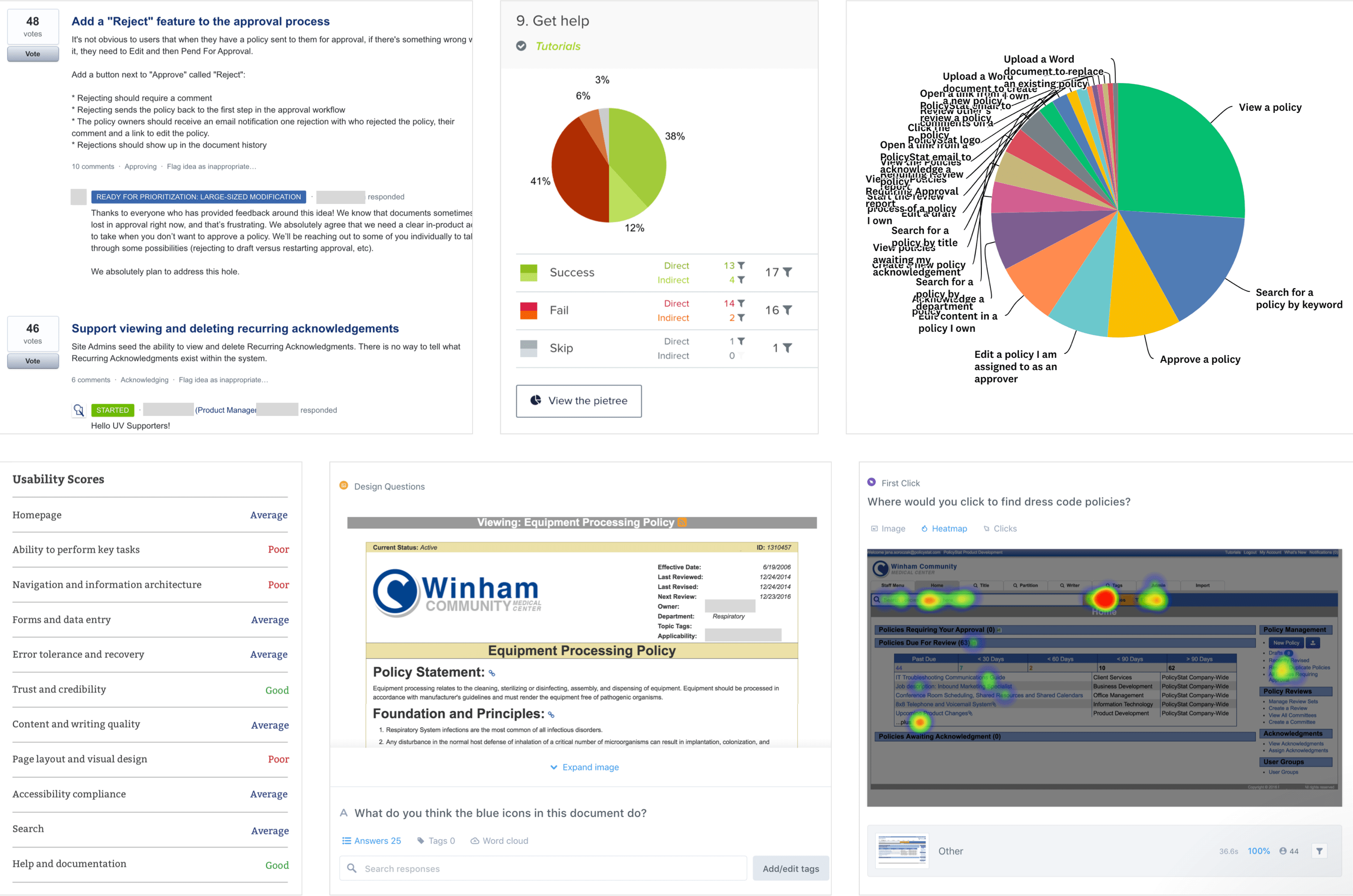
- Searched support tickets and feature requests for usability-related issues
- Surveyed over 600 users on top tasks and usability improvements
- Tested top tasks to assess ease of completion, task error & success rates, and time on task
- Conducted an expert audit of the app
- Tree tested the information architecture
- Interviewed sales and support teams to gain prospective and current customer insights
- Reviewed analytics reports
Creation of a Design System
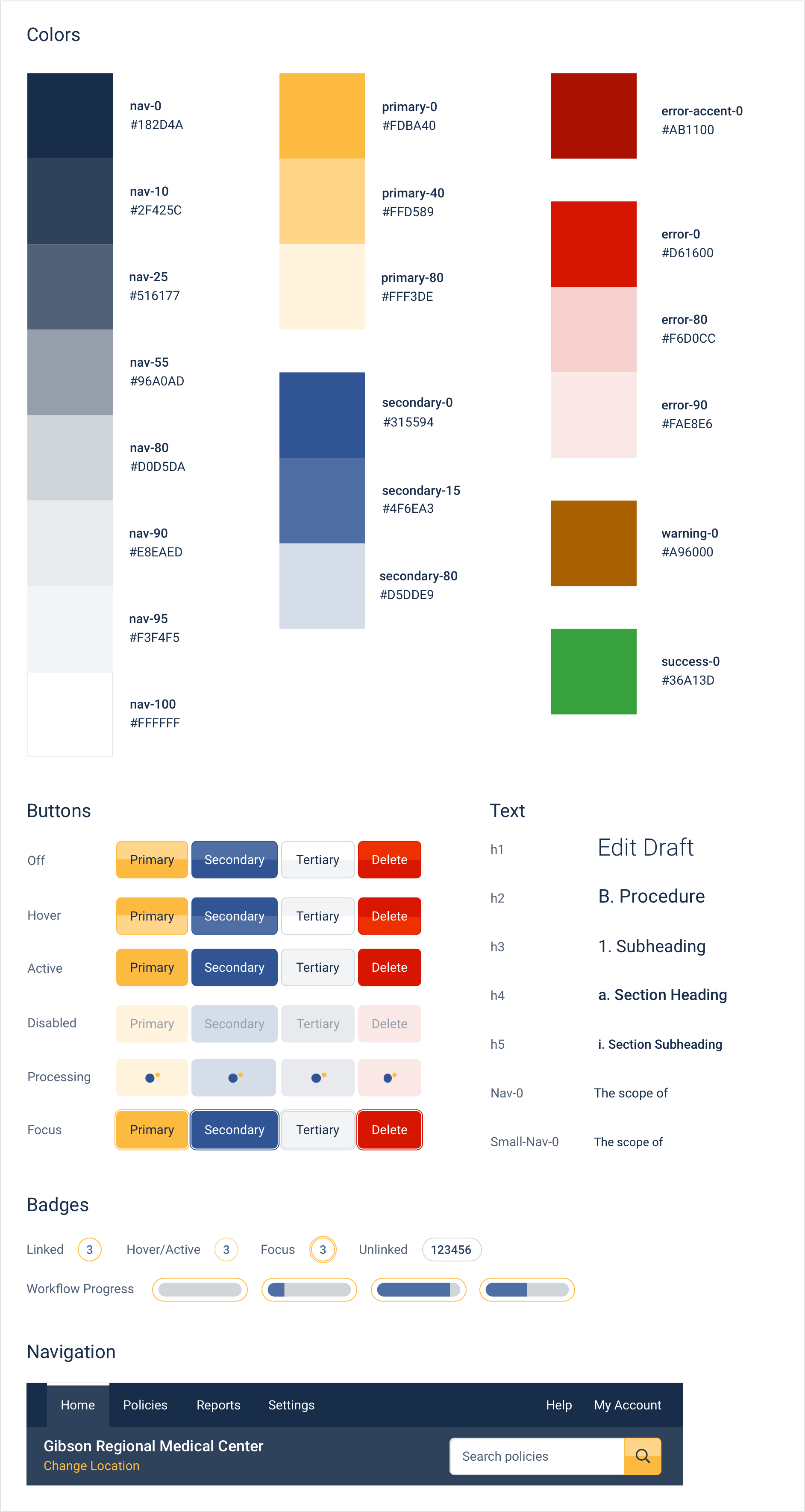
As we built out the new look and feel of PolicyStat, a design system was also put in place, starting with the basics such as palette, typography and interactive elements. Later the design system expanded to include patterns, layouts, components and best practice guidelines.
Colors, fonts, icons and graphic elements were revisited and fine-tuned many times more in order to ensure visual attractiveness, cohesion, and compliance with WCAG 2.0 accessibility guidelines, as well as Android and iOS mobile usability guidelines.
Top Tasks: Ideation, Testing & Iteration
All problems outlined below were uncovered in the discovery phase. Designs were user tested, iterated upon then tested again, sometimes as many as five times, before arriving at the solutions presented. Beta testing provided the opportunity to gather further insights from daily, live usage.
Problem
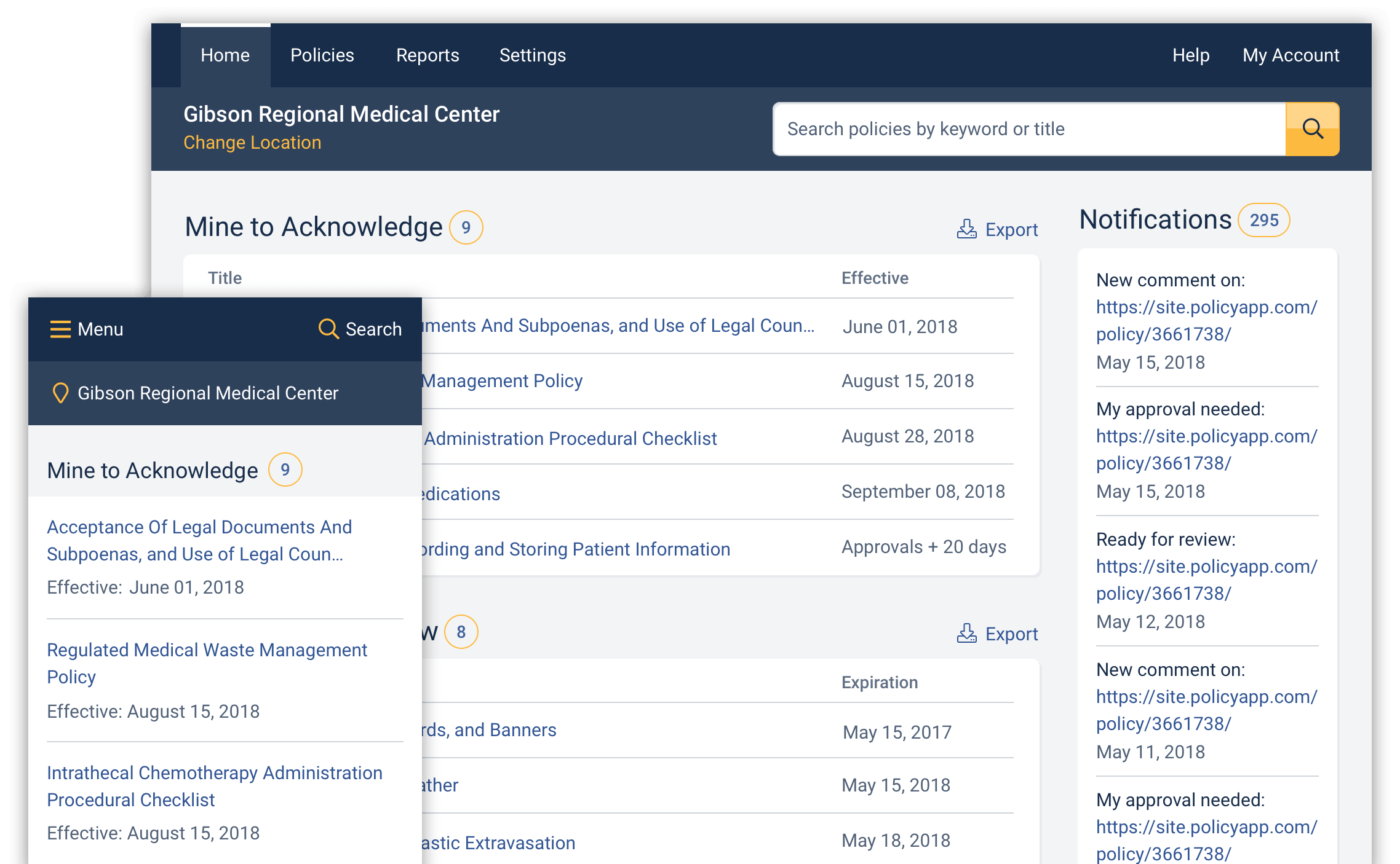
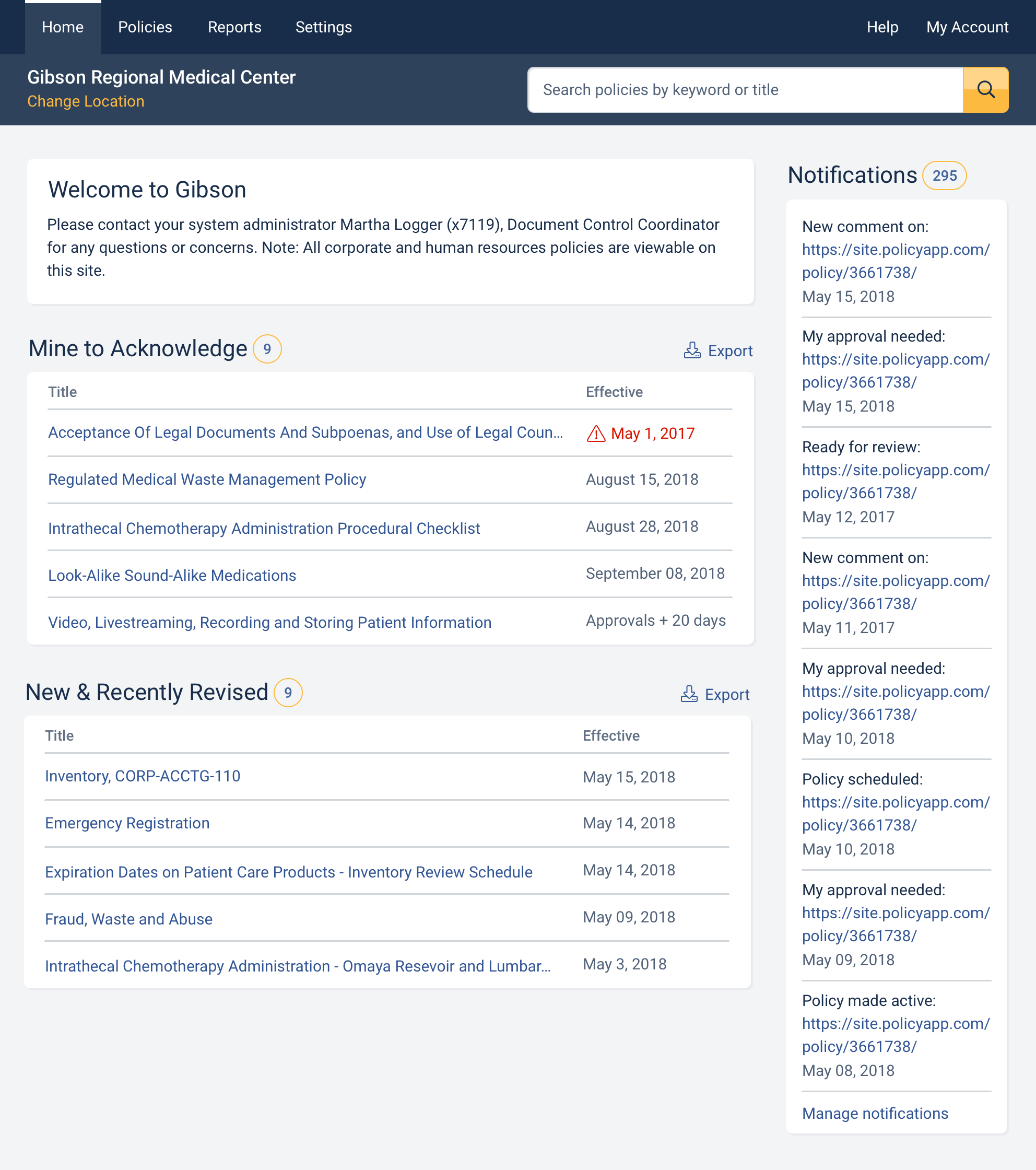
The original app had two homepages, with different content on each one. Registered users often overlook the Welcome page’s content, containing custom messages that site administrators would like users to read, as it is only accessible by logging in as a guest or by clicking the site’s logo after logging in as a registered user.
Method
Site administrators interviewed about pain points of their staff and users.
Solution
Move the Welcome content to the homepage and remove the redundant homepage.
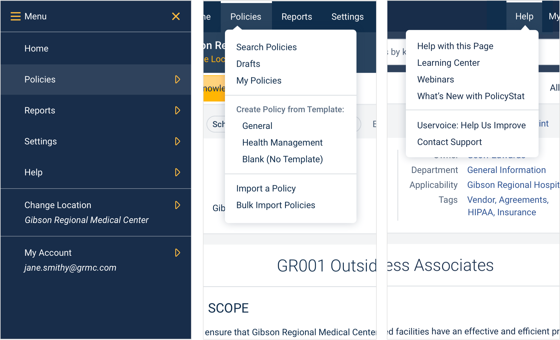
Problem
Large portions of the original navigation were embedded within the homepage and Admin page, requiring users to navigate to these pages to access most features.
Method
Tree testing and unmoderated testing of navigational tasks on first-time users. Moderated testing of navigational tasks on existing users, followed by interviews.
Solution
Create a global navigation that is fully accessible from policystat in the app, allowing users to get from point A to Z in fewer clicks, fewer page loads and less backtracking. A balance was struck between making the changed information architecture more intuitive for new users versus retaining enough familiarity to minimize the frustration and cognitive load of existing users having to relearn to navigate.
Problem
In the original app it is easy to overlook which hospital or lab location a user is viewing, causing frustration when searching for policies that they know should exist but cannot find, or when accidentally creating policies in the wrong location.
Method
Existing site administrators interviewed to ascertain pain points of their staff and users. Performed the Five Second Test on first-time users asking them to switch from viewing hospital ABC’s policies to hospital XYZ’s policies, in both the original app and in the new designs, comparing success rates and time on task.
Solution
Switch to text-only location headings instead of relying on user-uploaded logos. Ensure both the location name and the Change Location link are placed in a prominent location in the global navigation. Color the Change Location Link the design system’s eye-catching yellow, which is used sparingly and only for the most important elements on any given page.
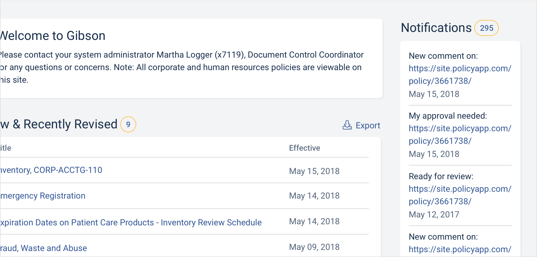
Problem
Notifications lived on a subpage in the original app. For users who turned off or ignored their email notifications, this means there was no noticable indicator of new items to take action on.
Method
Site administrators interviewed about pain points of their staff and users.
Solution
Add a notifications feed to the homepage.
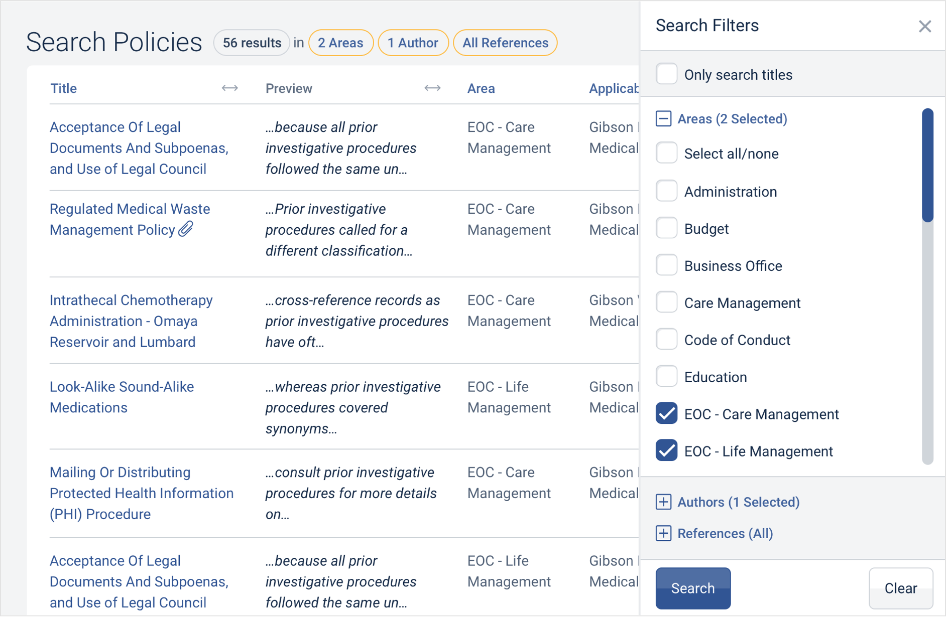
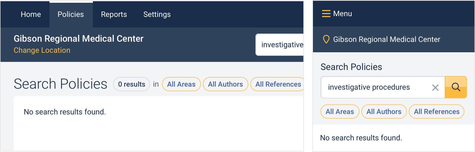
Problem
Search in the original app was divided into four separate pages, each searchable by only one filter type at a time: title, area, author or reference.
Method
Gathered via an expert audit and from user requests for feature improvements.
Solution
Search functionality merged into one page so that any search from the simplest to the most advanced can be performed.
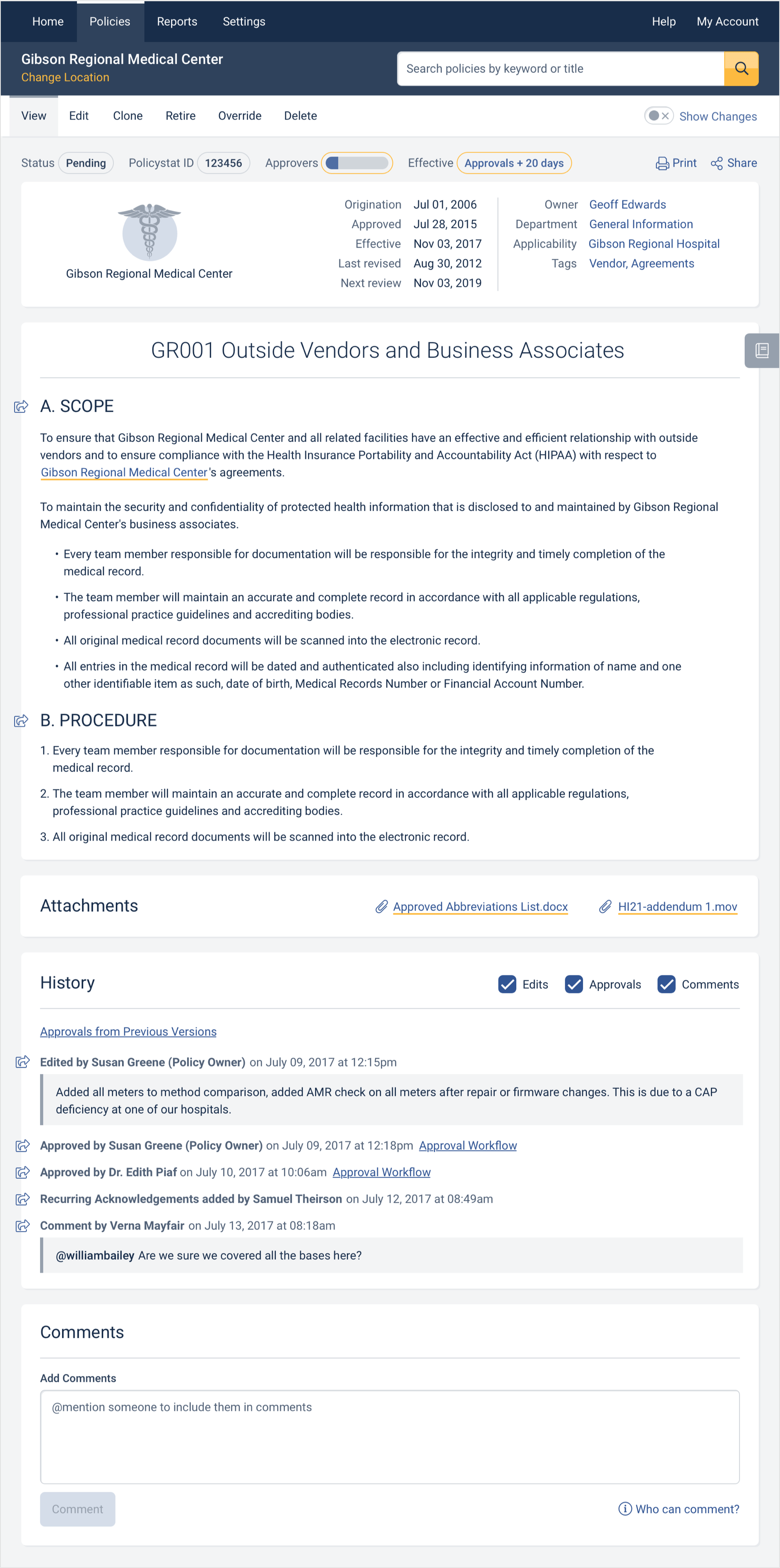
Problem
Reading a policy was be difficult for users due to distractions provided by secondary details and other features vying for their attention. Sharing options were also located in multiple places within a single policy.
Method
Unmoderated testing of the ability to parse a policy effectively on first time users in both the original app and new one. Five Second Tests to ascertain how much policy content versus features were remembered. Moderated testing of policy viewing tasks on existing users, followed by interviews.
Solution
Ensure that policy content is always the center of focus and that features – such as Show Changes/Timeline, Table of Contents, the Effective Date and Approval Workflows – are close by but minimized until needed. Group all sharing options together at the top right of the policy.
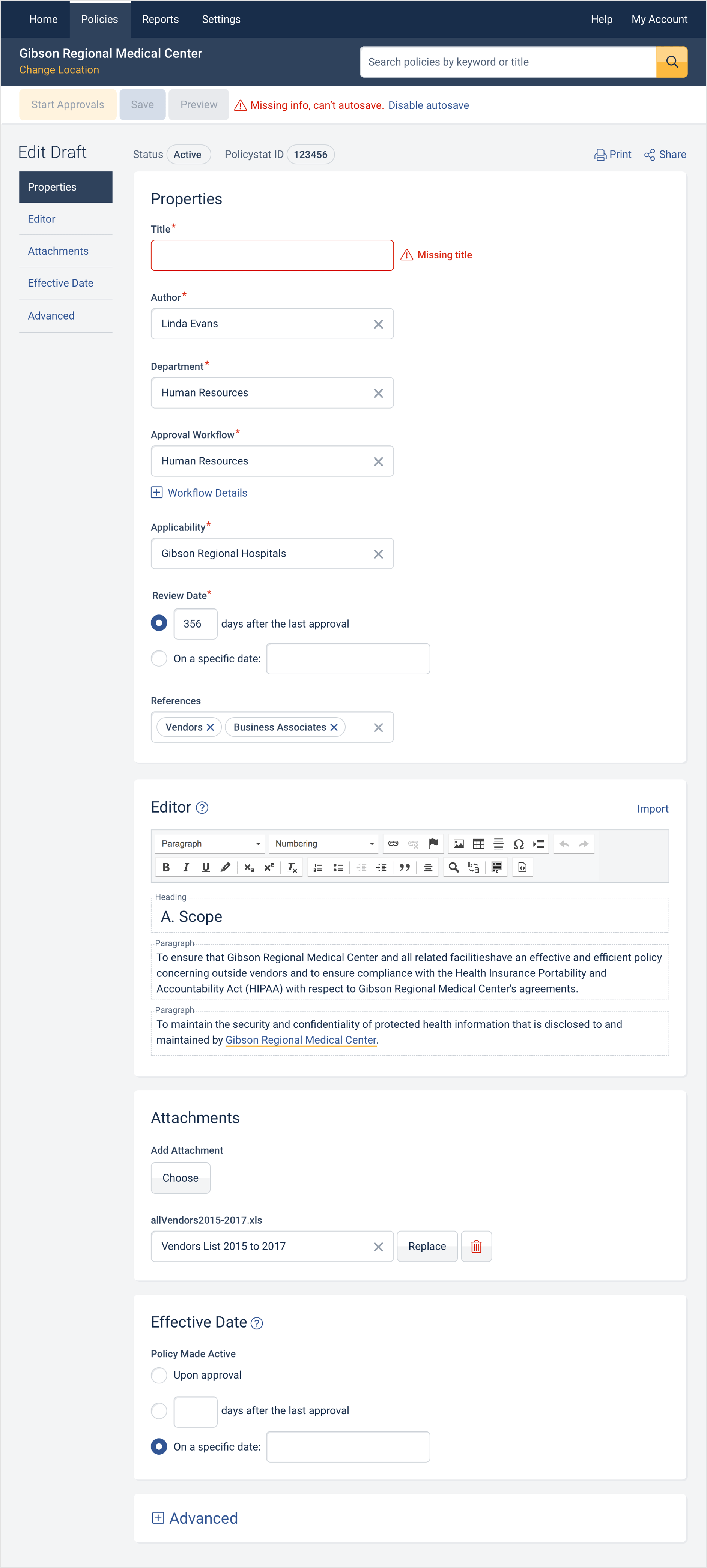
Problem
When editing a policy, its status and autosave options often sat directly over editable properties and policy content. Actions available to take on the draft policy were often hidden offscreen. Required policy properties were also often hidden from view, increasing the likelihood of generating system errors when editing policies.
Method
Gathered via an expert audit and from user requests for feature improvements. Moderated testing of policy viewing tasks on existing users, followed by interviews. Feedback from top tasks/usability survey.
Solution
Addition of an always visible “action bar” combining the policy’s status, autosave options and all actions that can be taken on the draft policy. Grouping of all required properties at the top of the page and streamlining of its design so that all the content editor and properties fit comfortably on a single page.
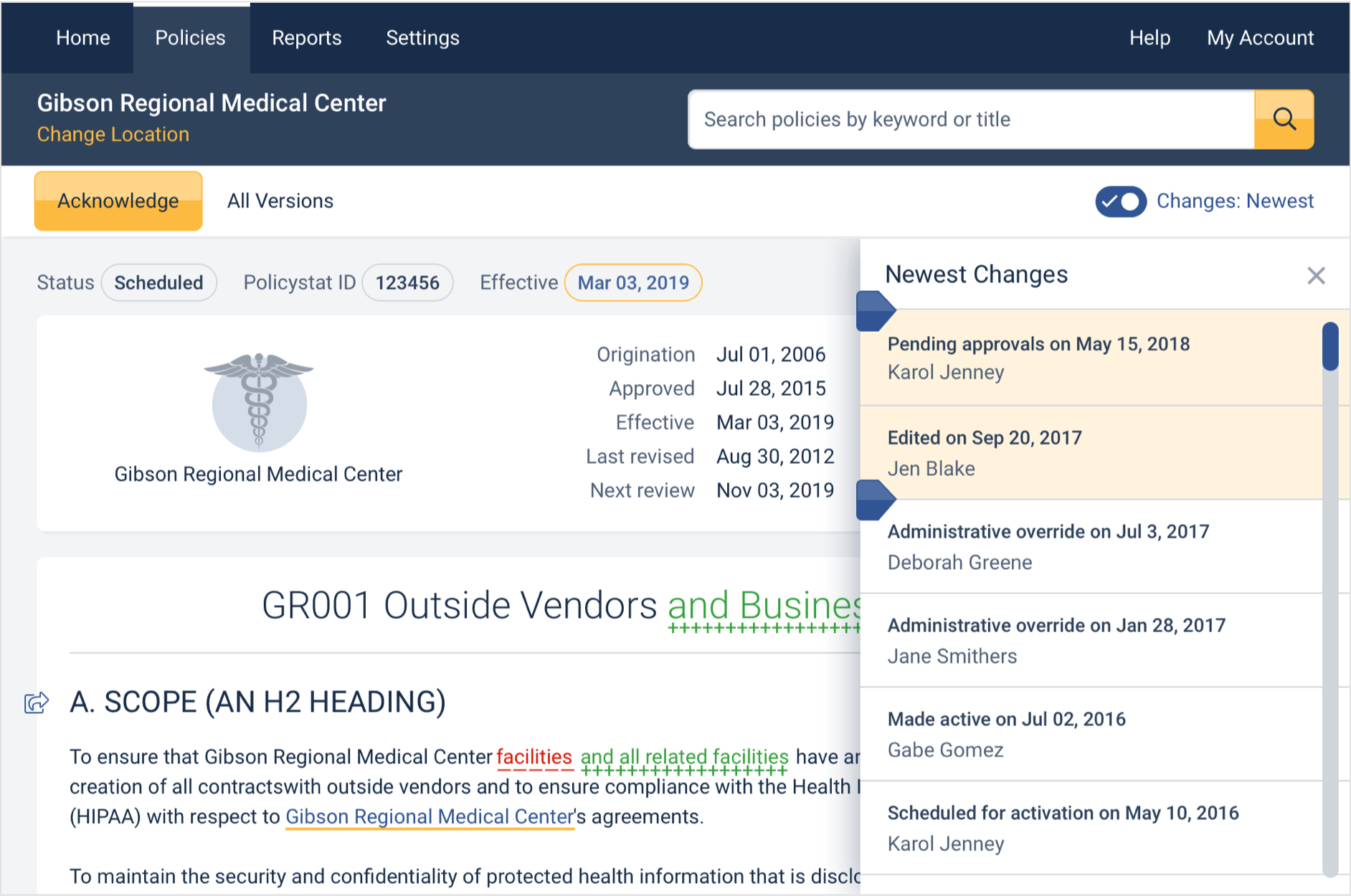
Problem
When reviewing a policy in order to acknowledge or approve it, many users misunderstood or ignored the Changes Timeline, an interactive history of changes made to a policy.
Method
Moderated testing of policy viewing tasks on existing users, followed by interviews.
Solution
Redesigned and merged the Show Changes and Changes Timeline functionality in order to be more intuitive, visible, and an overall more powerful tool.
Conclusion
As of 2018, the product team continued to work on building the frontend for searching and viewing policies while further additions were being made to the design system. Each pattern, component and page were being QA'd as they were coded for browser compatibility, usability, accessibility and adherence to the design specifications.